---
title: "Visualization Gallery"
subtitle: "Create Publication-Quality Climate Extreme Visualizations"
author: "Benny Istanto"
date: last-modified
execute:
eval: true
echo: true
warning: false
cache: true
format:
html:
code-fold: show
code-tools: true
---
## Overview
This tutorial demonstrates all visualization capabilities of the `precip-index` package using real TerraClimate data from Bali, Indonesia (1958-2024).
**What you'll learn:**
1. Basic index plots with WMO 11-category color scheme
2. Threshold sensitivity comparison
3. Event timeline with highlighting and annotations
4. Event characteristics analysis
5. 5-panel event evolution timeline
6. Magnitude comparison (cumulative vs instantaneous)
7. Spatial statistics maps (single-variable and multi-panel)
8. Period comparison (historical vs recent, side-by-side and difference)
9. Publication-quality export settings
10. Batch processing multiple locations
**All Plot Types:**
| Plot Type | Function | Best For |
|:--|:--|:--|
| Basic Index | `plot_index()` | Simple time series |
| Event Timeline | `plot_events()` | Event identification |
| Characteristics | `plot_event_characteristics()` | Event analysis |
| Evolution (5-panel) | `plot_event_timeline()` | Real-time monitoring |
| Spatial Maps | `plot_spatial_stats()` | Regional patterns |
## 1. Setup and Data Preparation
```{python}
import sys
import os
from pathlib import Path

# Get the notebook directory and find the repository root
notebook_dir = Path.cwd()
repo_root = notebook_dir
while not (repo_root / 'src').exists() and repo_root != repo_root.parent:
    repo_root = repo_root.parent

# Add src to path
src_path = str(repo_root / 'src')
if src_path not in sys.path:
    sys.path.insert(0, src_path)

import numpy as np
import xarray as xr
import pandas as pd
import matplotlib.pyplot as plt
import matplotlib.colors as mcolors
from datetime import datetime

# Event analysis
from runtheory import (
    identify_events,
    calculate_timeseries,
    calculate_period_statistics,
    compare_periods
)

# Visualization functions
from visualization import (
    plot_index,
    plot_events,
    plot_event_characteristics,
    plot_event_timeline,
    plot_spatial_stats
)

# Plotting settings
plt.rcParams['figure.figsize'] = (14, 6)
plt.rcParams['font.size'] = 10

# Create output directories
output_plots = repo_root / 'output' / 'plots'
output_netcdf = repo_root / 'output' / 'netcdf'
output_plots.mkdir(parents=True, exist_ok=True)
output_netcdf.mkdir(parents=True, exist_ok=True)

print("All imports successful!")
print(f"Repository root: {repo_root}")
```
```{python}
# Load SPI-12 from Bali
spi_file = repo_root / 'output' / 'netcdf' / 'spi_12_bali.nc'
spi_12 = xr.open_dataset(spi_file)['spi_gamma_12_month']

print(f"SPI-12 loaded: {spi_12.shape}")
print(f"  Time range: {spi_12.time[0].values} to {spi_12.time[-1].values}")
print(f"  Spatial extent: {len(spi_12.lat)} x {len(spi_12.lon)} grid")

# Select sample location (center of Bali)
lat_idx = len(spi_12.lat) // 2
lon_idx = len(spi_12.lon) // 2
spi_loc = spi_12.isel(lat=lat_idx, lon=lon_idx)
lat_val = float(spi_12.lat.values[lat_idx])
lon_val = float(spi_12.lon.values[lon_idx])

print(f"\nSample location: {lat_val:.2f}, {lon_val:.2f} (Central Bali)")

# Calculate event characteristics for all examples
threshold = -1.2
events = identify_events(spi_loc, threshold=threshold, min_duration=3)
ts = calculate_timeseries(spi_loc, threshold=threshold)
stats_2020 = calculate_period_statistics(spi_12, threshold=threshold,
                                          start_year=2020, end_year=2020)

print(f"\nFound {len(events)} dry events")
print(f"Time series: {len(ts)} months")
print("All data ready for visualization!")
```
## 2. Plot Type 1: Basic Index Visualization
The `plot_index()` function creates a time series bar chart with the WMO 11-category color scheme. Colors range from dark red (exceptionally dry) to dark purple (exceptionally moist).
```{python}
fig = plot_index(spi_loc, threshold=threshold,
                 title=f'SPI-12 at {lat_val:.2f}, {lon_val:.2f} - Bali (1958-2024)')
plt.tight_layout()
plt.show()
```
### Threshold Sensitivity Comparison
Different thresholds capture different severity levels. Lower thresholds identify fewer but more extreme events.
```{python}
fig, (ax1, ax2, ax3) = plt.subplots(3, 1, figsize=(14, 12), sharex=True)

plot_index(spi_loc, threshold=-1.0, ax=ax1,
           title='Moderate Dry (Threshold: -1.0)')

plot_index(spi_loc, threshold=-1.5, ax=ax2,
           title='Severe Dry (Threshold: -1.5)')

plot_index(spi_loc, threshold=-2.0, ax=ax3,
           title='Extreme Dry (Threshold: -2.0)')

plt.suptitle('Threshold Sensitivity Comparison - Bali', fontsize=14, y=0.995)
plt.tight_layout()
plt.show()
```
As the threshold becomes more negative, fewer time periods exceed it --- but those that do represent increasingly severe conditions.
### Focus on Recent Period
```{python}
recent_spi = spi_loc.sel(time=slice('2010', '2024'))
fig = plot_index(recent_spi, threshold=-1.0,
                 title='SPI-12: Recent Trends (2010-2024)')
plt.tight_layout()
plt.show()
```
## 3. Plot Type 2: Event Timeline
The `plot_events()` function highlights identified events on the time series, showing event boundaries, peak markers, and event shading.
```{python}
fig = plot_events(spi_loc, events, threshold=threshold,
                  title=f'Dry Events at {lat_val:.2f}, {lon_val:.2f} - Bali (1958-2024)')
plt.tight_layout()
plt.show()

print(f"Highlighted {len(events)} events")
```
### Custom Annotations
Add duration labels at peak values to identify the longest/most severe events.
```{python}
fig, ax = plt.subplots(figsize=(16, 6))
plot_events(spi_loc, events, threshold=threshold, ax=ax)

# Add duration labels at peaks
for idx, event in events.iterrows():
    ax.text(event['peak_date'], event['peak'] - 0.2,
            f"D={int(event['duration'])}m",
            ha='center', fontsize=8,
            bbox=dict(boxstyle='round,pad=0.3', facecolor='wheat', alpha=0.7))

ax.set_title('Dry Events with Duration Annotations - Bali', fontsize=13)
plt.tight_layout()
plt.show()
```
Each annotation shows the duration (D) of the event in months, positioned at the event peak. Longer durations indicate more persistent drought conditions.
::: {.callout-tip}
### Event Highlighting
Events are highlighted with:
- Shaded regions showing event duration
- Vertical lines marking start/end
- Peak markers for the most extreme value
- Event numbers for reference
:::
## 4. Plot Type 3: Event Characteristics
The `plot_event_characteristics()` function provides multi-panel analysis of event properties: distribution histograms, relationship scatter plots, and time evolution.
```{python}
if len(events) > 0:
    fig = plot_event_characteristics(events, characteristic='magnitude')
    plt.tight_layout()
    plt.show()
else:
    print("No events to analyze")
```
```{python}
# Duration vs Intensity
if len(events) > 0:
    fig = plot_event_characteristics(events, characteristic='intensity')
    plt.tight_layout()
    plt.show()
```
```{python}
# Duration distribution
if len(events) > 0:
    fig = plot_event_characteristics(events, characteristic='duration')
    plt.tight_layout()
    plt.show()
```
## 5. Plot Type 4: Event Evolution Timeline (5-Panel)
The 5-panel plot shows the complete evolution of events over time:
1. **Index value** (SPI-12) with threshold
2. **Duration** (current event length in months)
3. **Cumulative magnitude** (blue, total deficit --- always increasing during event)
4. **Instantaneous magnitude** (red, current severity --- varies within event)
5. **Intensity** (magnitude / duration)
```{python}
fig = plot_event_timeline(ts)

# Customize title
axes = fig.get_axes()
axes[0].set_title('')
fig.suptitle(f'Dry Event Evolution - Bali ({lat_val:.2f}, {lon_val:.2f})',
             fontsize=14, fontweight='bold', y=0.995)
plt.subplots_adjust(top=0.96)
plt.tight_layout()
plt.show()
```
### Focus on Recent Period
```{python}
recent_ts = ts[ts.index >= '2020-01-01']

if len(recent_ts) > 0:
    fig = plot_event_timeline(recent_ts)

    axes = fig.get_axes()
    axes[0].set_title('')
    fig.suptitle(f'Recent Dry Event Evolution (2020-present) - Bali',
                 fontsize=14, fontweight='bold', y=0.995)
    plt.subplots_adjust(top=0.96)
    plt.tight_layout()
    plt.show()
else:
    print("No recent data available")
```
## 6. Magnitude Comparison
Two types of magnitude provide different insights into drought evolution. Understanding their difference is key for operational monitoring.
### Stacked Comparison
```{python}
fig, (ax1, ax2) = plt.subplots(2, 1, figsize=(14, 8), sharex=True)

# Get event mask
event_mask = ts['is_event']
cumulative_event = ts['magnitude_cumulative'].where(event_mask)
instantaneous_event = ts['magnitude_instantaneous'].where(event_mask)

# Cumulative (blue)
ax1.fill_between(ts.index, 0, cumulative_event,
                 alpha=0.4, color='steelblue', label='Cumulative')
ax1.plot(ts.index, cumulative_event, color='darkblue', linewidth=2)
ax1.set_ylabel('Cumulative Magnitude', fontsize=11)
ax1.set_title('Cumulative Magnitude (Total Deficit - Always Increasing)', fontsize=12)
ax1.set_ylim(bottom=0)
ax1.legend()
ax1.grid(True, alpha=0.3)

# Instantaneous (red)
ax2.fill_between(ts.index, 0, instantaneous_event,
                 alpha=0.4, color='coral', label='Instantaneous')
ax2.plot(ts.index, instantaneous_event, color='darkred', linewidth=2)
ax2.set_ylabel('Instantaneous Magnitude', fontsize=11)
ax2.set_xlabel('Time', fontsize=11)
ax2.set_title('Instantaneous Magnitude (Current Severity - Variable)', fontsize=12)
ax2.set_ylim(bottom=0)
ax2.legend()
ax2.grid(True, alpha=0.3)

plt.suptitle('Magnitude Types Comparison - Bali', fontsize=14, y=0.995)
plt.tight_layout()
plt.show()
```
### Twin-Axis Comparison
Overlay both magnitude types on a single plot with dual y-axes to see their relationship during events.
```{python}
event_mask = ts['is_event']
event_periods = ts[event_mask]

if len(event_periods) > 0:
    fig, ax1 = plt.subplots(figsize=(14, 6))

    # Cumulative (left axis)
    color1 = 'steelblue'
    ax1.set_xlabel('Time', fontsize=11)
    ax1.set_ylabel('Cumulative Magnitude', color=color1, fontsize=11)
    ax1.plot(event_periods.index, event_periods['magnitude_cumulative'],
             color=color1, linewidth=2, label='Cumulative')
    ax1.tick_params(axis='y', labelcolor=color1)
    ax1.grid(True, alpha=0.3)

    # Instantaneous (right axis)
    ax2 = ax1.twinx()
    color2 = 'darkred'
    ax2.set_ylabel('Instantaneous Magnitude', color=color2, fontsize=11)
    ax2.plot(event_periods.index, event_periods['magnitude_instantaneous'],
             color=color2, linewidth=2, linestyle='--', label='Instantaneous')
    ax2.tick_params(axis='y', labelcolor=color2)

    plt.title('Dual Magnitude Evolution (Twin Axes) - Bali', fontsize=13)

    # Combined legend
    lines1, labels1 = ax1.get_legend_handles_labels()
    lines2, labels2 = ax2.get_legend_handles_labels()
    ax1.legend(lines1 + lines2, labels1 + labels2, loc='upper left')

    fig.tight_layout()
    plt.show()

    print("\nKey Observation:")
    print("  Blue (cumulative) always increases during event")
    print("  Red (instantaneous) varies with SPI pattern (peaks and valleys)")
else:
    print("No event periods to plot")
```
::: {.callout-note}
### Magnitude Types
- **Cumulative**: Total deficit, monotonically increases during event --- like debt accumulation. Use for event comparison and total impact assessment.
- **Instantaneous**: Current severity, varies within event --- like NDVI crop phenology. Use for monitoring evolution and trend detection.
:::
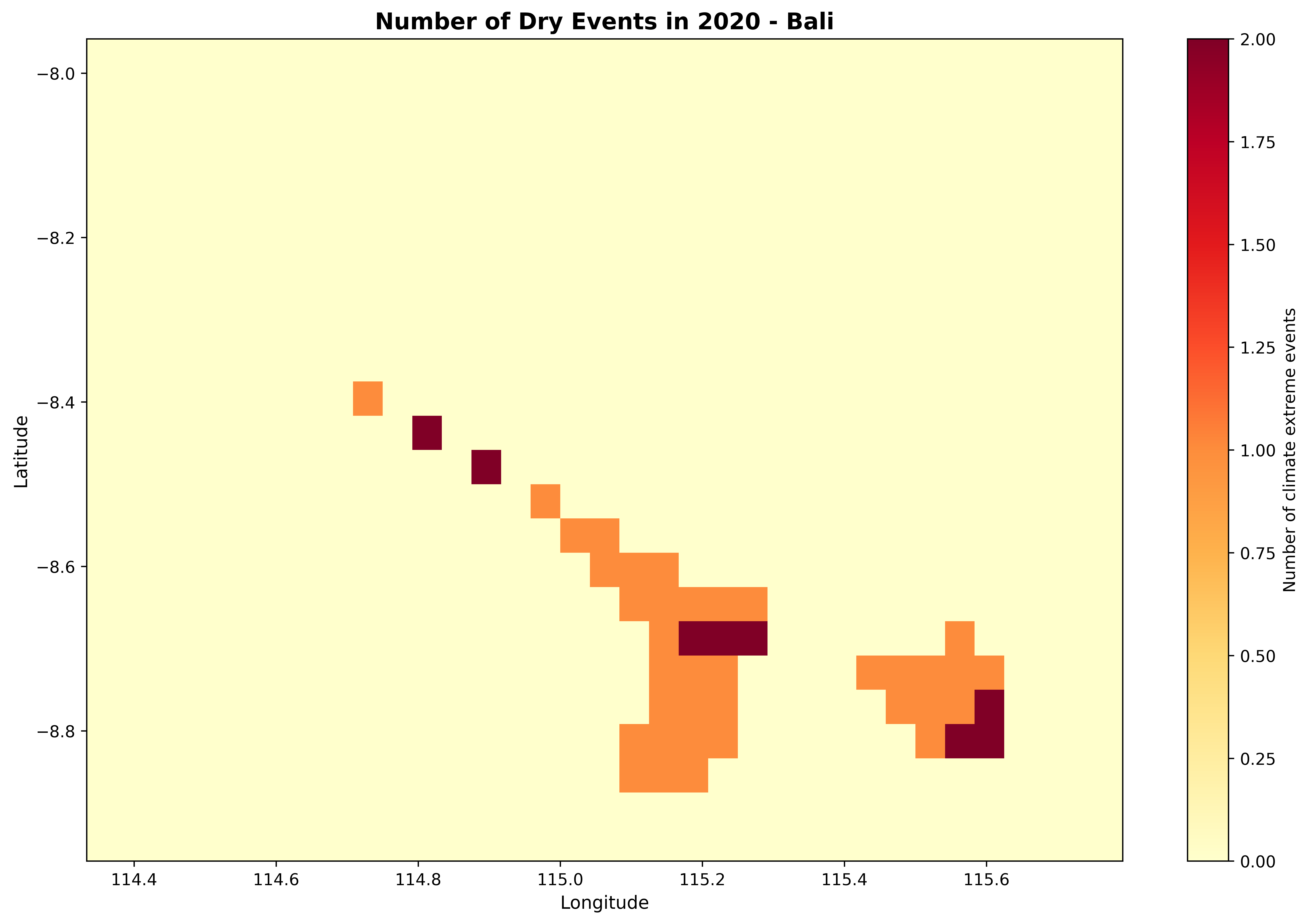
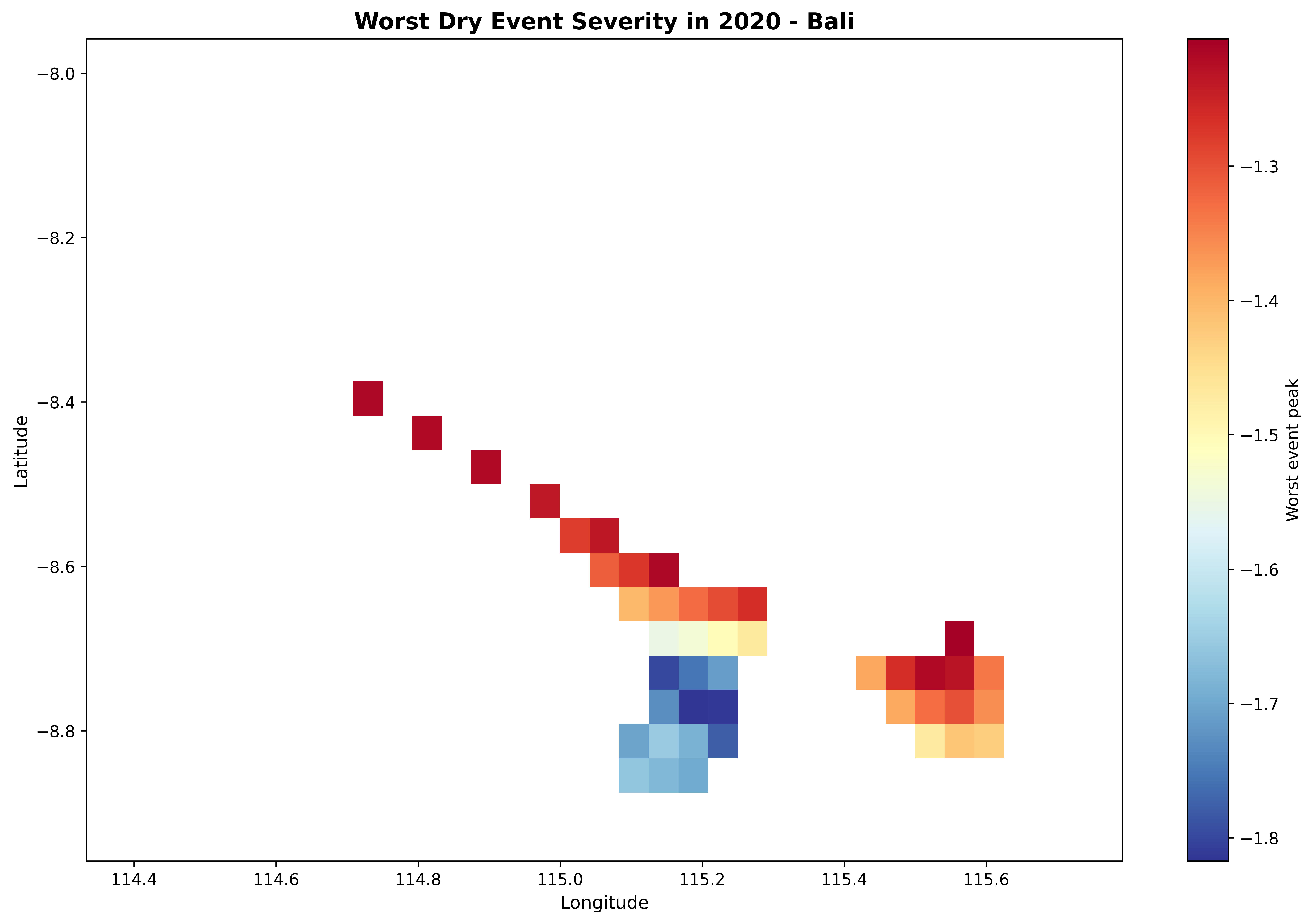
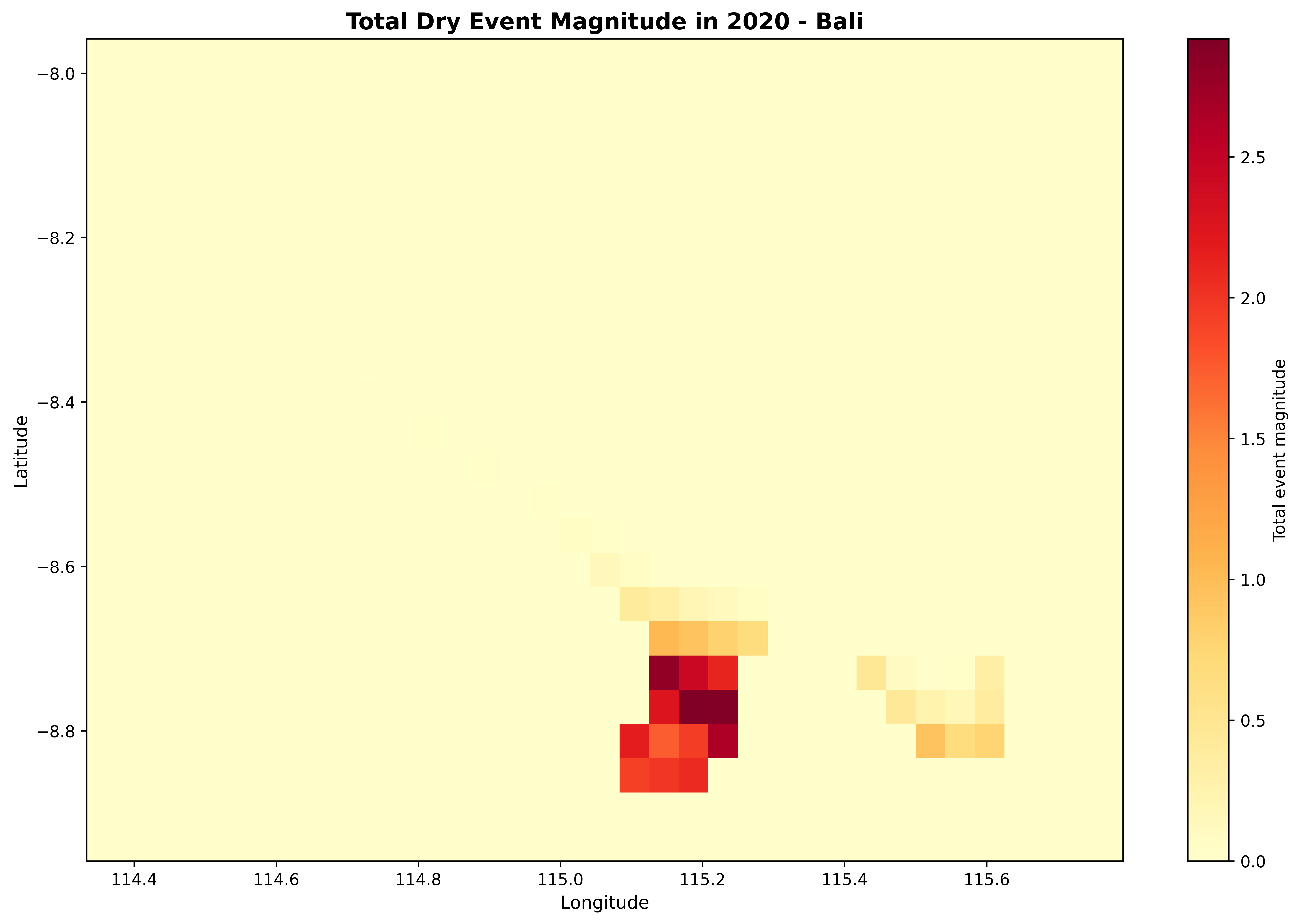
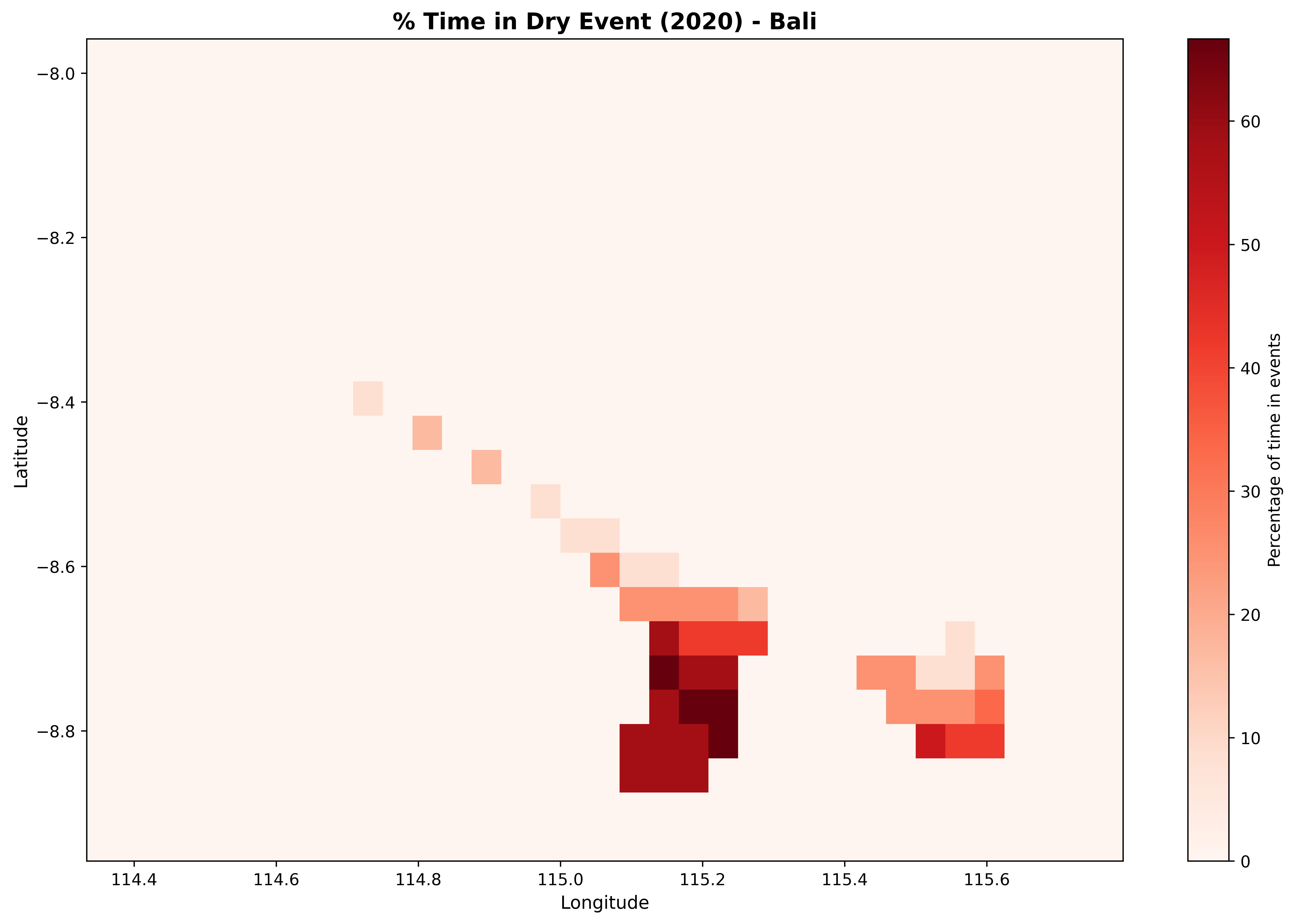
## 7. Plot Type 5: Spatial Event Statistics
The `plot_spatial_stats()` function creates maps of event statistics across the grid, showing which areas are most affected.
### Individual Statistics Maps
```{python}
# Event count
fig = plot_spatial_stats(stats_2020, variable='num_events',
                          title='Number of Dry Events in 2020 - Bali',
                          cmap='YlOrRd')
plt.tight_layout()
plt.show()
```
```{python}
# Worst severity
fig = plot_spatial_stats(stats_2020, variable='worst_peak',
                          title='Worst Dry Event Severity in 2020 - Bali',
                          cmap='RdYlBu_r')
plt.tight_layout()
plt.show()
```
```{python}
# Total magnitude
fig = plot_spatial_stats(stats_2020, variable='total_magnitude',
                          title='Total Dry Event Magnitude in 2020 - Bali',
                          cmap='YlOrRd')
plt.tight_layout()
plt.show()
```
```{python}
# Percent time in drought
fig = plot_spatial_stats(stats_2020, variable='pct_time_in_event',
                          title='% Time in Dry Event (2020) - Bali',
                          cmap='Reds')
plt.tight_layout()
plt.show()
```
### Multi-Variable Summary Panel
```{python}
fig, axes = plt.subplots(2, 2, figsize=(16, 12))

variables = ['num_events', 'worst_peak', 'total_magnitude', 'pct_time_in_event']
titles = ['Event Count', 'Worst Severity', 'Total Magnitude', '% Time in Dry Event']
cmaps = ['YlOrRd', 'Reds_r', 'YlOrRd', 'Reds']

for ax, var, title, cmap in zip(axes.flat, variables, titles, cmaps):
    if var == 'num_events':
        cbar_kwargs = {'label': title, 'format': '%d'}
    else:
        cbar_kwargs = {'label': title}

    stats_2020[var].plot(ax=ax, cmap=cmap, cbar_kwargs=cbar_kwargs)
    ax.set_title(title, fontsize=12)
    ax.set_xlabel('Longitude')
    ax.set_ylabel('Latitude')

plt.suptitle('Dry Event Statistics Summary - Bali (2020)', fontsize=14, y=0.995)
plt.tight_layout()
plt.show()
```
## 8. Period Comparison
Compare historical and recent periods to detect changes in drought frequency and severity.
```{python}
print("Comparing historical vs recent periods...")
comparison = compare_periods(
    spi_12,
    periods=[(1991, 2020), (2021, 2024)],
    period_names=['Historical (1991-2020)', 'Recent (2021-2024)'],
    threshold=threshold,
    min_duration=3
)
print("Comparison calculated")
```
### Side-by-Side Comparison
```{python}
fig, (ax1, ax2) = plt.subplots(1, 2, figsize=(16, 6))

# Historical
comparison.sel(period='Historical (1991-2020)').num_events.plot(
    ax=ax1, cmap='YlOrRd', vmin=0, vmax=10,
    cbar_kwargs={'label': 'Events'}
)
ax1.set_title('Historical Period (1991-2020)', fontsize=12)
ax1.set_xlabel('Longitude')
ax1.set_ylabel('Latitude')

# Recent
comparison.sel(period='Recent (2021-2024)').num_events.plot(
    ax=ax2, cmap='YlOrRd', vmin=0, vmax=10,
    cbar_kwargs={'label': 'Events'}
)
ax2.set_title('Recent Period (2021-2024)', fontsize=12)
ax2.set_xlabel('Longitude')
ax2.set_ylabel('Latitude')

plt.suptitle('Dry Event Count Comparison - Bali', fontsize=14, y=0.98)
plt.tight_layout()
plt.show()
```
### Difference Map
```{python}
diff = comparison.sel(period='Recent (2021-2024)') - comparison.sel(period='Historical (1991-2020)')

fig, ax = plt.subplots(figsize=(12, 6))

diff.num_events.plot(ax=ax, cmap='RdBu_r', center=0,
                     cbar_kwargs={'label': 'Change in Events'})
ax.set_title('Change in Dry Events (Recent - Historical) - Bali', fontsize=13)
ax.set_xlabel('Longitude')
ax.set_ylabel('Latitude')

plt.tight_layout()
plt.show()

mean_change = float(diff.num_events.mean().values)
print(f"\nAverage change in events: {mean_change:+.2f}")
if mean_change > 0:
    print("  More dry events in recent period")
elif mean_change < 0:
    print("  Fewer dry events in recent period")
else:
    print("  No change in average events")
```
Red areas indicate an increase in drought events during the recent period compared to the historical baseline; blue indicates a decrease.
## 9. Multi-Scale Comparison
Compare how drought signals appear at different time scales.
```{python}
# Load multi-scale SPI
ds_multi = xr.open_dataset(output_netcdf / 'spi_multi_scale_bali.nc')

# Extract time series at sample location
spi_3 = ds_multi['spi_gamma_3_month'].isel(lat=lat_idx, lon=lon_idx)
spi_6 = ds_multi['spi_gamma_6_month'].isel(lat=lat_idx, lon=lon_idx)
spi_12_loc = ds_multi['spi_gamma_12_month'].isel(lat=lat_idx, lon=lon_idx)

# Create 3-panel comparison
fig, axes = plt.subplots(3, 1, figsize=(14, 10), sharex=True)

for ax, spi_data, scale in zip(axes, [spi_3, spi_6, spi_12_loc], [3, 6, 12]):
    plot_index(spi_data, threshold=-1.0, title=f'SPI-{scale}', ax=ax)

axes[-1].set_xlabel('Time')
plt.tight_layout()
plt.show()
```
SPI-3 shows high-frequency monthly variability, while SPI-12 captures longer-term trends. Extreme events persist longer at longer time scales.
## 10. Dry vs Wet Event Comparison
Compare drought and wet events on the same time series.
```{python}
# Identify both types
drought_events = identify_events(spi_loc, threshold=-1.2, min_duration=3)
wet_events = identify_events(spi_loc, threshold=+1.2, min_duration=3)

# Create comparison plot
fig, (ax1, ax2) = plt.subplots(2, 1, figsize=(14, 10), sharex=True)

plot_events(spi_loc, drought_events, threshold=-1.2,
            title='Drought Events (Threshold -1.2)', ax=ax1)

plot_events(spi_loc, wet_events, threshold=+1.2,
            title='Wet Events (Threshold +1.2)', ax=ax2)

ax2.set_xlabel('Time')
plt.tight_layout()
plt.show()

print(f"\nDrought events: {len(drought_events)}  |  Wet events: {len(wet_events)}")
```
## 11. Publication Quality Settings
For journal submissions and reports, use high-resolution settings with publication-ready fonts.
```{python}
# Set publication-quality parameters
plt.rcParams.update({
    'figure.dpi': 300,
    'savefig.dpi': 300,
    'font.family': 'serif',
    'font.size': 11,
    'axes.labelsize': 12,
    'axes.titlesize': 13,
    'xtick.labelsize': 10,
    'ytick.labelsize': 10,
    'legend.fontsize': 10,
    'figure.titlesize': 14
})

print("Publication settings activated")
```
```{python}
# Create publication-ready figure
fig = plot_events(spi_loc, events, threshold=threshold,
                  title=f'Dry Events Analysis - Bali, Indonesia ({lat_val:.2f}, {lon_val:.2f})')

# Save in multiple formats
plt.savefig(output_plots / 'publication_quality.png', dpi=300, bbox_inches='tight')
plt.savefig(output_plots / 'publication_quality.pdf', bbox_inches='tight')  # Vector format
plt.show()

print("Saved PNG (raster) and PDF (vector) versions")
```
```{python}
# Reset to default
plt.rcParams.update(plt.rcParamsDefault)
plt.rcParams['figure.figsize'] = (14, 6)
plt.rcParams['font.size'] = 10
print("Reset to default settings")
```
::: {.callout-tip}
### Export Best Practices
- **DPI**: 300 for publications, 150 for presentations, 72 for web
- **Format**: PNG for raster, PDF/SVG for vector graphics
- **Bbox**: Always use `bbox_inches='tight'` to avoid cropping
- **Memory**: Use `plt.close()` in loops to free memory
:::
## 12. Batch Processing Multiple Locations
Process and visualize multiple locations across the study area in a single loop.
```{python}
n_lat = len(spi_12.lat)
n_lon = len(spi_12.lon)

locations = [
    (n_lat // 4, n_lon // 4, 'Northwest Bali'),
    (n_lat // 4, 3 * n_lon // 4, 'Northeast Bali'),
    (3 * n_lat // 4, n_lon // 4, 'Southwest Bali'),
    (3 * n_lat // 4, 3 * n_lon // 4, 'Southeast Bali'),
]

print(f"Generating plots for {len(locations)} locations across Bali...")
print()

for lat_i, lon_i, name in locations:
    loc_spi = spi_12.isel(lat=lat_i, lon=lon_i)
    loc_lat = float(spi_12.lat.values[lat_i])
    loc_lon = float(spi_12.lon.values[lon_i])

    loc_events = identify_events(loc_spi, threshold=threshold, min_duration=3)

    fig = plot_events(loc_spi, loc_events, threshold=threshold,
                      title=f'{name}: {loc_lat:.2f}, {loc_lon:.2f}')
    plt.close()  # Close to save memory

    print(f"  {name:20s}: {len(loc_events)} events")

print(f"\nAll {len(locations)} location plots generated!")
```
Batch processing is useful for generating reports across multiple stations, grid cells, or regions. Use `plt.close()` in loops to prevent memory accumulation.
## 13. Summary
### Color Scheme Reference
The WMO 11-category color scheme used in all index plots:
| SPI Range | Category | Color |
|:--|:--|:--|
| <= -2.0 | Exceptionally Dry | Dark Red |
| -2.0 to -1.5 | Extremely Dry | Red |
| -1.5 to -1.2 | Severely Dry | Orange |
| -1.2 to -0.7 | Moderately Dry | Light Orange |
| -0.7 to -0.5 | Abnormally Dry | Yellow |
| -0.5 to +0.5 | Near Normal | White |
| +0.5 to +0.7 | Abnormally Moist | Light Green |
| +0.7 to +1.2 | Moderately Moist | Green |
| +1.2 to +1.5 | Very Moist | Teal |
| +1.5 to +2.0 | Extremely Moist | Blue |
| >= +2.0 | Exceptionally Moist | Purple |
### Colormap Recommendations
| Use Case | Colormap |
|:--|:--|
| Event counts / magnitudes | `YlOrRd`, `Reds` |
| Severity / peaks (diverging) | `RdYlBu_r`, `RdBu_r` |
| Index values | `RdYlBu` |
| Differences (change detection) | `RdBu_r` with `center=0` |
## Next Steps
- Explore the [User Guide](../user-guide/index.qmd) for methodology details
- Check the [Technical Documentation](../technical/index.qmd) for API reference
- Create your own visualizations with your data