The full operational evaluation: IMERG-L corrected over 2001-2025, validated against 172 independent BMKG stations (gauge record 2001-2021).
This is the case the framework was built for: daily satellite precipitation over a sparse-gauge tropical archipelago. The figures below are from the full Indonesia run (IMERG-L corrected against CPC-UNI, validated against independent BMKG stations whose gauge record runs 2001-2021). The inputs and outputs are deposited on Zenodo (https://doi.org/10.5281/zenodo.20287846); they are too large to ship in the repo, so this study is presented as curated figures and analysis rather than a runnable notebook.
Note
The full LSEQM+DL run over Indonesia is a long batch job: expect hours to days depending on hardware. That is a rough estimate, not a benchmarked timing (the quantile-mapping stage alone is costed at roughly 8 hours of CPU in the EQM implementation notes). This page documents that run; it is not regenerated when the docs build. To reproduce it, download the Zenodo bundle, point config.yml at it, and run nb02-nb06. For a runnable end-to-end example, use the Bali case instead.
If you have not already, skim Reading the Results first - it explains every metric used below.
Study design
The reference is CPC-UNI (gauge-interpolated). The independent check is the BMKG station network, which is not part of the CPC pipeline, so it is a genuinely held-out validation set.
Figure 1: BMKG station network across Indonesia, coloured by region. 180 stations archived; the network is Java-heavy and sparse in the east.
Not every archived station enters the validation. Two filters are applied before any metric is computed: a station must fall on the 0.1 deg land mask, and it must have at least 30 paired days per dekadal window. This takes the set from 180 archived stations to 172 validated across all seven regions.
Figure 2: Validation funnel: 180 archived stations to 172 validated, after the land-mask and minimum-paired-days filters.
Overview: what improves
The headline result, evaluated at the 172 independent stations, is a clear win on the mean, variability, and extremes:
Figure 3: Stage-wise skill at 172 independent BMKG stations: relative bias, standard-deviation ratio, Q99 ratio, and CSI.
Interactive version (same numbers; hover for values, dashed line marks the target):
Relative bias moves from -0.114 (LS undercorrects the mean) to +0.009 (LSEQM) and -0.006 (LSEQM+DL): near-zero after distribution correction.
Standard-deviation ratio moves from 0.71 (raw/LS is too smooth) to 1.03 (LSEQM) and 1.00 (LSEQM+DL): variability restored.
Q99 ratio moves from 0.71 to 1.05 (LSEQM) and 1.01 (LSEQM+DL): the extreme tail is recovered.
CSI stays around 0.49-0.53 across stages: categorical detection is set early and the later stages do not change it much.
Detection skill, broken out by intensity threshold, shows the same story: LS already does most of the categorical work at light thresholds, and skill degrades with intensity as expected for daily satellite precipitation.
Figure 4: Multi-threshold verification (WMO/TD-1485): POD, FAR, CSI, ETS from 1 to 100 mm/day.
The static figure above pools the climatology. The version below is interactive: pick a dekad and a score to see how the three methods compare across intensity thresholds for that specific 10-day window. Shaded bands are the inter-quartile range across stations; points drop out at high thresholds where too few stations record enough events to pass the WMO/TD-1485 minimum (see the FAQ).
{const k = mtMetric.key;const sub = mt.filter(d => d.month=== mtPeriod.month&& d.dekad=== mtPeriod.dekad&& d[k] !=null);if (!sub.length) returnhtml`<em>No verified stations for this dekad/score.</em>`;return Plot.plot({width:880,height:420,marginLeft:55,x: {type:"log",label:"Threshold (mm/day)",domain: [1,160],ticks: [1,5,10,20,50,100,150],tickFormat: d => d},y: {label: mtMetric.key.toUpperCase() +" (median across stations)",grid:true,domain: [0,1]},color: {legend:true,domain: ["LS","LSEQM","LSEQM+DL"],range: ["#3b78b0","#f39c12","#27ae60"]},marks: [ Plot.areaY(sub.filter(d => d[k +"_lo"] !=null), {x:"threshold",y1: k +"_lo",y2: k +"_hi",fill:"method",fillOpacity:0.12,curve:"catmull-rom"}), Plot.line(sub, {x:"threshold",y: k,stroke:"method",strokeWidth:2,curve:"catmull-rom"}), Plot.dot(sub, {x:"threshold",y: k,fill:"method",r:3.2}), Plot.tip(sub, Plot.pointer({x:"threshold",y: k,stroke:"method",title: d =>`${d.method}\n${d.threshold} mm (${d.label})\n${mtMetric.key.toUpperCase()} = ${d[k].toFixed(3)}`})) ] });}
Reading it: at light thresholds (1-10 mm) all three methods sit close together - LS already captures most wet-day detection. The methods separate little even at heavier thresholds, because categorical detection depends on when it rains (timing the satellite sets), not on the distribution reshaping that LSEQM applies. This is the categorical face of the same correlation ceiling.
The Taylor diagram summarises correlation, variability, and centred RMSE in one view, split by season. The bias-corrected products pull the variability ratio toward the reference, while correlation stays in the same band - the pattern explained in the correlation ceiling below.
Figure 5: Station-level Taylor diagram by season (wet Oct-Mar, dry Apr-Sep).
Spatial skill
Mapped across the archipelago, the Continuous Quality Index (CQI) is spatially coherent for all three methods, and sits in the Fair band on the QA tier scale (0.40 to 0.60: improves on the raw satellite, significant biases remain) rather than the Good band. The honest finding is that the median CQI does not rise from LS (0.541) to LSEQM (0.505) to LSEQM+DL (0.508):
Figure 6: CQI spatial distribution by method (climatology over 36 dekads). Median CQI: LS 0.541, LSEQM 0.505, LSEQM+DL 0.508.
This is not a defect, and it is worth stating plainly. The CQI weights the basic-statistics component at 0.4, and that component is relative bias (0.30), RMSE (0.30) and NSE (0.40). Pearson correlation is deliberately not in it, because NSE already carries the linear-association term. Because those timing-sensitive metrics do not improve under marginal bias correction - and RMSE slightly worsens when EQM restores variance against a mistimed series - the composite index does not reward the distribution and extreme gains that LSEQM delivers. The improvement map makes the trade explicit: relative to LS, LSEQM+DL lowers CQI at most pixels.
Figure 7: CQI improvement (LSEQM+DL minus LS) and the LSEQM+DL quality-category map. Mean change is about -0.03; most pixels move slightly down on the composite index even though distribution and extreme metrics improve.
The takeaway: choose the product by what you need. If you need the right distribution and extremes (most hydrological and risk applications), LSEQM / LSEQM+DL is the right choice despite the flat composite index. If you only need the basic mean field and nothing else, LS is competitive.
Skill is stable across the seasonal cycle and does not collapse in any region:
Daily Pearson r for LSEQM+DL against the independent BMKG stations at the native window, taken as the per-station median of the dekadal values and then the median within each main-island region over the 171 stations that have one: the gauge-dense west (Sumatra 0.17, Jawa 0.20) sits below the sparse east (Papua 0.31, Maluku 0.33), so daily correlation does not track gauge density.
Skill across the seasonal cycle.
The interactive version below is computed live from the 175-station metadata (2001-2021). Pick a metric and product; bars are the regional median, whiskers the inter-quartile range across stations in each region:
{const col = regOptions.get(regMetricName)[regProduct];const order = ["Sumatra","Jawa","Kalimantan","Sulawesi","Bali Nusa Tenggara","Maluku","Papua"];const byReg = d3.groups(meta.filter(d => d[col] !=null&&Number.isFinite(d[col])), d => d.region).map(([region, rows]) => {const vals = rows.map(r => r[col]).sort(d3.ascending);return {region,n: rows.length,med: d3.median(vals),lo: d3.quantile(vals,0.25),hi: d3.quantile(vals,0.75)}; }).sort((a, b) => order.indexOf(a.region) - order.indexOf(b.region));return Plot.plot({width:880,height:360,marginBottom:80,x: {label:null,tickRotate:-25,domain: order},y: {grid:true,label: regMetricName},marks: [ Plot.ruleY([0]), Plot.barY(byReg, {x:"region",y:"med",fill:"#27ae60",fillOpacity:0.85}), Plot.ruleX(byReg, {x:"region",y1:"lo",y2:"hi",stroke:"#145a32",strokeWidth:2}), Plot.text(byReg, {x:"region",y:"med",text: d => d.med?.toFixed(2), dy:-8,fontSize:10}), Plot.text(byReg, {x:"region",y:0,text: d =>`n=${d.n}`,dy:14,fontSize:9,fill:"#666"}) ] });}
One point from the regional breakdown: daily correlation does not track gauge density. Read off the chart above, the regional medians of per-station daily Pearson r against the BMKG gauges (LSEQM+DL, native window, whole 2001-2021 record, 175-station explorer set) span about 0.18 to 0.37. That range is a live reading of the explorer data on this page, not a headline validation figure. Maluku and Papua, with far fewer stations than Java, are not systematically worse. This tells us the ceiling on daily correlation is set by something other than how many gauges are nearby - again, see below.
Extreme values
The GPD tail graft is designed to recover heavy-rain behaviour. Across stations, the corrected-to-gauge ratio at heavy thresholds (20, 50, 100 mm/day) moves toward 1.0 where LS alone leaves a deficit:
Figure 8: Corrected / gauge heavy-day ratio at every station, by region and threshold (2001-2021).
Interactive version below: pick a product and region. Each cell is the ratio of product to gauge heavy-day counts (counted on gauge-valid days only); white is a perfect match (1.0), blue is under-detection, red is over-detection. Cells are blank where fewer than 5 gauge events make the ratio unreliable. Toggle IMERG-L vs LSEQM+DL to watch the heavy-rain deficit (blue) close toward white after correction.
viewof exRegion = Inputs.select( ["All regions","Sumatra","Jawa","Kalimantan","Sulawesi","Bali Nusa Tenggara","Maluku","Papua"], {label:"Region",value:"Jawa"})
{let sub = extremes.filter(d => d.product=== exProduct);if (exRegion !=="All regions") sub = sub.filter(d => d.region=== exRegion); sub = sub.map(d => ({...d,label:`${d.name} (${d.wmo})`}));const order = [...newSet( sub.slice().sort((a, b) => d3.ascending(a.region, b.region) || d3.descending(a.lat, b.lat)).map(d => d.label) )];const h =70+ order.length*13;return Plot.plot({width:720,height: h,marginLeft:175,marginBottom:45,x: {type:"band",domain: [1,5,10,20,50,100],label:"Threshold (mm/day)",tickFormat: d => d +" mm"},y: {domain: order,label:null},color: {type:"diverging",scheme:"RdBu",pivot:1,reverse:true,domain: [0.5,1.5],clamp:true,legend:true,label:`${exProduct} / gauge heavy-day ratio`},marks: [ Plot.cell(sub, {x:"threshold",y:"label",fill:"ratio",inset:0.5,tip:true,channels: {Region:"region","n events":"n_gauge",ratio:"ratio"}}) ] });}
The same correction read as detection and intensity metrics for heavy days:
Figure 9: Heavy-day metrics across stations.
And as a calendar view of where and when the heaviest events land after LSEQM+DL correction:
Figure 10: Calendar of corrected extreme events (LSEQM+DL).
Event-level view, by station
Zooming all the way in: the daily series around each station’s heaviest rain days, comparing the gauge with the raw and corrected products. Pick a station to see how the correction handles its biggest events. These six span the archipelago, from Aceh to Papua.
This is the central diagnostic of the study, and the most important thing the framework reveals about daily satellite precipitation.
Under marginal bias correction, Pearson correlation barely moves. Against the CPC-UNI calibration reference (daily, native window, per-pixel spatial median over land, and therefore in-sample), it goes 0.343 (LS) to 0.345 (LSEQM) to 0.348 (LSEQM+DL), a shift of +0.005. Against the independent BMKG stations, built the same way, the same correlation is lower and just as flat: 0.242 (LS), 0.236 (LSEQM), 0.239 (LSEQM+DL). RMSE and NSE do not improve either. Only the distribution-shape metrics (SDR, Q99) move to target.
Figure 11: What does and does not improve under marginal bias correction. Pearson r is flat; RMSE and NSE do not improve; only SDR moves to target. Reference note: r, RMSE and NSE here are per-pixel values against the in-sample CPC-UNI reference; the standard-deviation ratio is the per-station value against the independent BMKG network.
Interactive version - each panel has its own y-axis so the shape of the trajectory is what matters. Watch Pearson r stay almost flat while the std-dev ratio climbs to its target. The panels do not share a reference and the labels say which is which: the first three are per-pixel against CPC-UNI (in-sample), the std-dev ratio is per-station against the independent BMKG stations. Against CPC-UNI the std-dev ratio does not converge on 1.0, it overshoots (0.97 to 1.16 to 1.15), so the two references must not be read as one story.
Placing every product in the same two-axis skill space makes the pattern unmistakable. The horizontal axis is timing (Pearson r, per pixel against CPC-UNI); the vertical axis is spread (standard-deviation ratio, per station against the independent BMKG network). Each correction stage moves products vertically - EQM lifts the spread ratio onto the gauge target - while they all stay pinned on the same vertical line of low correlation. No stage moves toward the r = 1 target on the right.
Figure 12: Skill space for the Indonesia run, plotted from the same stage numbers as above: LS, LSEQM, and LSEQM+DL move vertically (EQM pulls the std-dev ratio, measured per station against the independent BMKG network, from 0.71 onto the gauge target near 1.0) but stay pinned at r near 0.35 against the in-sample CPC-UNI reference. The two axes use different references: measured against CPC-UNI instead, the std-dev ratio overshoots to about 1.15 rather than settling on 1.0. The gauge target (r = 1, SDR = 1) is unreachable by marginal correction.
The reason is structural, not a failure of the method. Quantile mapping is a monotone non-decreasing transform applied per pixel: it changes the values and introduces no rank reversals, so the day-to-day ordering inherited from the satellite survives largely intact. The exception is dry-day matching, which ties about 43% of days at zero and does reshuffle the pairing slightly. So once LS has set the rank structure, distribution correction leaves Pearson r pinned close to the value the satellite’s own day-to-day timing sets, moving it only within sampling noise.
Figure 13: Theoretical bound under marginal correction: because the transform introduces no rank reversals, correlation stays pinned close to its raw value while the variance ratio is free to move.
The rank argument is not just theory. Tracing every day’s global rank through the four pipeline stages, the lines stay almost perfectly horizontal: LS and EQM introduce no rank reversals (dry-day tying aside), and the CNN adds only tiny perturbations. With the ordering left largely intact, correlation moves only within sampling noise.
Figure 14: Rank trajectory: each day’s global rank through raw IMERG-L, LS, LSEQM, and LSEQM+DL. The near-horizontal lines confirm that the chain leaves day-to-day ordering largely intact, so Pearson r stays pinned close to its raw value.
Where the ceiling comes from
A natural question is whether the ceiling is intrinsic to the satellite retrieval, or an artefact of how the data are aligned in time. IMERG accumulates on a UTC day; a BMKG gauge “day” is a local-morning-to-morning window. Indonesia spans three time zones, so the satellite day and the gauge day are offset by hours.
Figure 15: The satellite UTC day and the BMKG gauge day are not the same window.
Shifting the satellite accumulation window and recomputing correlation reveals a clear peak well away from zero offset. Against the independent BMKG stations, the single pooled daily correlation rises from 0.20 at the native UTC-day alignment the archive uses (h = 0) to 0.57 at the harmonised window (h = -23, a 23-hour backward shift).
Figure 16: Daily Pearson r against the BMKG stations (single pooled correlation over all station-days) as a function of hour-offset between the satellite window and the gauge day. The curve peaks at h = -23, not at h = 0.
The optimal offset is spatially organised by time zone, confirming it is a real timing-window effect and not noise:
Figure 17: Per-station optimal offset, organised by time zone across Indonesia.
Repeating the window search at every station individually confirms it is not a pooled artefact. At the harmonised window the typical station reaches a daily correlation of 0.56 (the median of the per-station peak r over the 178 stations with half-hourly coverage, inter-quartile range 0.51 to 0.62, GPM era 2015-2021), in line with the 0.57 single pooled value above and far above the 0.20 pooled at the native UTC alignment. The timing limit is a window mismatch, not irreducible noise.
Figure 18: Per-station window diagnostics: (a) the offset where each station’s correlation peaks; (b) the daily correlation each station reaches once its window is harmonised - the per-station median is 0.56 (IQR 0.51 to 0.62), against a pooled 0.20 at the native window. The timing ceiling is a calendar-window artefact, recoverable per station. The per-station peak offset has a median of -23 h with an inter-quartile range of -23 to -21 h.
Harmonising the accumulation window therefore lifts the pooled daily correlation against the independent stations from 0.20 to 0.57, so a large part of the apparent timing ceiling is a calendar-window artefact (fixable by aligning the accumulation window to the local day) rather than irreducible retrieval error. This is a methodological caveat that applies to any daily verification of UTC-accumulated satellite precipitation against locally-defined gauge days, not just this framework.
Important
The practical implication: do not judge daily satellite precipitation - corrected or raw - on Pearson r alone. A low daily r is partly a timing-window artefact. Judge the correction on the distribution and extreme metrics, which is what the bias correction can actually move, and re-aggregate or re-window before computing correlation if timing fidelity matters for your application.
All-station summary
Explore any station
The chart below is interactive. Pick a station and a year to see the daily series for the gauge, raw IMERG-L, and the corrected LSEQM+DL product, with skill metrics for the selected station updating alongside.
About this data
This explorer covers 175 stations over the full 2001-2021 record - every BMKG station with at least one full year of valid gauge data (close to the 172 validated in the headline pipeline; the small difference is a simpler completeness filter). Completeness varies by station and is shown in the dropdown and on the map - sparse stations have visible gaps in the daily series. Each station’s daily record (~120 KB) is fetched only when you select it, so the page stays light. Per-station metrics are computed over 2001-2021, so they are close to but not identical to the headline figures above (which use the full pipeline’s pairing rules).
meta =FileAttachment("../data/case-studies/station_meta.csv").csv({typed:true})
// Each station's full 2001-2021 daily record is fetched on demand (~150 KB).stationRows = d3.csv(`station-data/${wmo}.csv`, d3.autoType)
yearsAvailable =Array.from(newSet(stationRows.map(d => d.date.getUTCFullYear()))).sort((a, b) => a - b)viewof year = Inputs.select(yearsAvailable, {label:"Year",value: yearsAvailable[yearsAvailable.length-1]})
The same station as a scatter against the gauge (all paired days, 2001-2021), raw IMERG-L on the left and corrected LSEQM+DL on the right. Points on the dashed 1:1 line are perfect agreement. Hover any point for its date and values. The corrected cloud sits closer to the diagonal and recovers the heavy-rain points that raw IMERG-L compresses toward the axis:
The pattern to look for: LSEQM+DL pulls the intensity and bias toward the gauge (relative bias toward zero; in the time series the green line tracks the black gauge peaks better than grey raw IMERG; in the scatter the green cloud hugs the 1:1 line), while Pearson r barely changes between raw and corrected - the correlation ceiling at the single-station level, visible as the vertical scatter that neither product removes.
Network skill map
Where does each metric sit geographically? Pick a metric to recolour the 175 explorer stations on the map below. Hover a marker for the station name, region, and value; the station selected in the dropdown above is ringed.
{const m = metricChoice;const pts = meta.filter(d =>Number.isFinite(d[m.key]));const sel = meta.find(d =>String(d.wmo) ===String(wmo));const diverging = m.scheme==="RdBu";return Plot.plot({width:920,height:360,marginLeft:50,x: {label:"Longitude",domain: [94,142]},y: {label:"Latitude",domain: [-11,7]},aspectRatio:1,grid:true,color: {legend:true,label: m.label,scheme: m.scheme,domain: m.domain,...(diverging ? {pivot:0} : {}) },marks: [ Plot.frame(), sel ? Plot.dot([sel], {x:"lon",y:"lat",r:9,stroke:"#111",strokeWidth:2,fill:"none"}) :null, Plot.dot(pts, {x:"lon",y:"lat",fill: d => d[m.key],r:5,stroke:"#333",strokeWidth:0.4,channels: {Station:"name",Region:"region",value: d => d[m.key]},tip: {format: {Station:true,Region:true,value: d => d3.format(".3f")(d),x:false,y:false,fill:false}}}) ].filter(Boolean) });}
A useful comparison: switch between IMERG-L Pearson r and LSEQM+DL Pearson r and note how little the colours change - correlation is set before correction. Then switch to relative bias: the same stations move clearly toward neutral (white) after correction. This is the spatial echo of the correlation ceiling: bias correction moves what it can (the colour on the bias map), not the day-to-day timing (the colour on the r map).
Dry-day skill
Dry days are about half the validated record, so getting the no-rain days right matters as much as getting the wet days right. The two charts below show what the products actually do when the gauge says it is dry.
The first chart is the before-vs-after scatter for two dry-day metrics: each point is one of the 175 stations, x-axis = raw IMERG-L, y-axis = corrected LSEQM+DL. Points above the dashed 1:1 line are stations where the correction improved that metric.
viewof dryMetric = Inputs.radio(newMap([ ["Correct-dry rate (higher better, target 1.0)","correctdry"], ["Wet-day frequency ratio (target 1.0)","wetfreq"] ]), {label:"Metric",value:"correctdry"})
{const k = dryMetric;const pts = meta.filter(d => d[`${k}_imergl`] !=null&& d[`${k}_lseqmdl`] !=null).map(d => ({wmo: d.wmo,name: d.name,region: d.region,x: d[`${k}_imergl`],y: d[`${k}_lseqmdl`]}));const isRatio = k ==="wetfreq";// For correct-dry the target is 1.0 (higher better); for wet-freq ratio target is 1.0 (either side worse).const lo = isRatio ?Math.min(0.4, d3.min(pts, d =>Math.min(d.x, d.y))) :0.3;const hi = isRatio ?Math.max(2.2, d3.max(pts, d =>Math.max(d.x, d.y))) :1.0;const axisLabel = isRatio ?"Wet-day frequency ratio":"Correct-dry rate";return Plot.plot({width:700,height:480,marginLeft:65,marginBottom:55,aspectRatio:1,x: {label:`IMERG-L (raw) - ${axisLabel}`,domain: [lo, hi],grid:true},y: {label:`LSEQM+DL - ${axisLabel}`,domain: [lo, hi],grid:true},color: {legend:true,label:"Region",domain: ["Sumatra","Jawa","Kalimantan","Sulawesi","Bali Nusa Tenggara","Maluku","Papua"],range: ["#1f77b4","#ff7f0e","#2ca02c","#d62728","#9467bd","#8c564b","#e377c2"]},marks: [// 1:1 line Plot.line([[lo, lo], [hi, hi]], {stroke:"#888",strokeDasharray:"4 3"}),// target line (correct-dry: y=1 is target; for ratio: cross at x=1, y=1) isRatio ? Plot.ruleX([1], {stroke:"#444",strokeWidth:1}) :null, isRatio ? Plot.ruleY([1], {stroke:"#444",strokeWidth:1}) :null, Plot.dot(pts, {x:"x",y:"y",fill:"region",r:4,stroke:"white",strokeWidth:0.6,channels: {Station:"name",Region:"region",WMO:"wmo"},tip: {format: {Station:true,Region:true,WMO:true,x: d => d.toFixed(3),y: d => d.toFixed(3)}}}), Plot.frame() ].filter(Boolean) });}
For correct-dry, most stations sit above the 1:1 line: the median across the 175 explorer stations moves from 0.547 (raw IMERG-L) to 0.681 (LSEQM+DL). That is a per-station median from raw to corrected, and it is a different construction from the headline validation figure, which is a pooled contingency rate over 5,899 station-dekad records at the 172 validated stations and runs 56.2% (LS) to 69.3% (LSEQM+DL). The two land in the same place but are not the same quantity, so read them side by side rather than as a match. For wet-day frequency ratio, the cloud moves from above 1.0 (raw over-detects, median 1.23) toward 1.0 (median 0.97) - the EQM stage doing its job. A handful of stations cross under 1.0 (LSEQM+DL slightly under-detects), an honest cost of matching the reference dry-day fraction.
The simplest way to read the dry-day result is the scorecard below. Each row asks one plain question and shows the raw IMERG-L value alongside the corrected LSEQM+DL value, with the change between them.
Figure 19: Reader-friendly summary: four questions about dry / no-rain days, raw IMERG-L vs LSEQM+DL. Numbers are the median across the 175-station network, 2001-2021. On gauge-dry days the product agrees more often (correct-dry: 55% to 70%); on the days the gauge records exactly zero, the product also reports zero far more often (32% to 73%); false-alarm rate drops (36% to 30%); and the wet-day frequency ratio moves from over-detection (1.23) toward the gauge target (0.97).
The biggest single gain is exact-zero match: on the 49% of days when the gauge reports a true zero, raw IMERG-L matches with a true zero only 32% of the time (it usually reports drizzle or light rain), while LSEQM+DL matches with an exact zero 73% of the time. This is the EQM dry-day reclassification visible at its sharpest.
For a more technical breakdown of what the product reports instead of zero - the four-bin composition of gauge-dry days, and how the per-station improvement is distributed - the figure below shows both:
Figure 20: (a) Median composition on gauge-dry days, IMERG-L vs LSEQM+DL: the EQM stage grows the dry slice and shrinks the drizzle / light slices. (b) Per-station shift in correct-dry rate: the median of the per-station differences is +0.124, and 162 of the 175 stations improve (93%). 175-station explorer basis, 2001-2021.
On the days the gauge records as dry, IMERG-L is dry only 55% of the time and reports drizzle / light / heavy on the rest. LSEQM+DL pushes the dry bin to 68%, shrinking the drizzle and light slices. The heavy slice barely moves (5% before, 5% after) - those are the rare big-event mismatches that EQM does not try to suppress. The right panel shows this is not driven by a few stations: the per-station shift is positive at 95% of the 175 stations, with a median improvement of +0.134 in correct-dry rate.
Spatial pattern across all stations
Across the validated stations, the spatial pattern of heavy-day preservation is consistent across thresholds - the correction does not just work on average, it works at most individual stations:
Figure 21: All-station spatial pattern of heavy-day preservation (corrected / gauge ratio) at 20, 50, 100 mm/day.
Heavy-event detection and the underlying mechanism, across the full station set:
Heavy-day detection across all stations.
Correction mechanism: per-station scatter.
Per-product comparison
A close look at what each stage does, day by day, at a single pixel. All products track the gauge’s wet-dry rhythm; the corrected products differ mainly in how they handle intensity and the tail:
Figure 22: What each stage does, day by day, at one station (Met. Mozes Kilangin, Papua, July 2020).
A full year at one pixel, all six products overlaid:
Figure 23: Daily precipitation through 2020 at one pixel: all products.
The same year as a running total tells the bias story cleanly: raw IMERG-L over-accumulates through the year, and the correction brings the cumulative curve back onto the CPC-UNI target, with the independent BMKG gauge corroborating it.
Figure 24: Cumulative 2020 rainfall at one station: raw IMERG-L over-catches; the correction brings the running total onto the CPC-UNI target, with the independent BMKG gauge as a check.
Zooming back out to every day of the 25-year record at one station, raw above and corrected below as day-by-day heatmaps, the correction preserves the wet-dry rhythm while adjusting intensity - it does not invent or erase rain days:
Figure 25: Every day of 25 years at one station (Papua), raw IMERG-L above and LSEQM+DL below. The correction adjusts intensity without changing the day-to-day wet-dry pattern.
Aggregated to monthly totals by region, and as a single-day spatial field, the corrected product is spatially coherent and seasonally consistent:
Monthly totals by region.
Single-day spatial field, all products.
Stage effects across the archipelago
The single-day maps above show the products; the maps below show what the correction does to them, mapped over Indonesia. First, the per-pixel difference fields for one day: where the correction adds rain (red) and where it removes it (blue), and the net LSEQM+DL minus IMERG-L effect.
Figure 26: Per-pixel difference maps for 1 January 2025: (a) raw IMERG-L minus CPC-UNI, (b) LSEQM+DL minus CPC-UNI, (c) the net correction effect (LSEQM+DL minus IMERG-L).
Across three representative days, the corrected field tracks the CPC-UNI reference far more closely than raw IMERG-L, confirming the single-day view is not cherry-picked:
Figure 27: Day-to-day variation across three days (dekad-1 January 2025): raw IMERG-L, CPC-UNI reference, and LSEQM+DL corrected.
Reading the same comparison through the four metric pillars - relative bias, KS p-value, Q99 ratio, and CSI - mapped per pixel for each correction stage, shows where each stage earns its keep across the archipelago:
Figure 28: Per-pixel climatological metrics by correction stage (LS, LSEQM, LSEQM+DL) for dekad-1 January: relative bias, KS p-value, Q99 ratio, and CSI.
Finally, the dekad-1 January climatology with the BMKG station means overlaid as triangles, for each product. The corrected field’s colours sit closest to the station markers, the spatial echo of the bias and distribution gains:
Figure 29: Dekad-1 January climatology with BMKG station means overlaid (triangles): CPC-UNI, IMERG-L, LSEQM+DL, and IMERG-F.
Summary
Question
Answer from the Indonesia run
Does the mean improve?
Yes - relative bias near zero after LSEQM.
Does the distribution improve?
Yes - SDR 0.71 to 1.00, KS gap shrinks.
Do extremes improve?
Yes - Q99 ratio 0.71 to 1.01; heavy-day ratios move to 1.0.
Does daily correlation improve?
No - it stays pinned near 0.35 against the in-sample CPC-UNI reference (near 0.24 against the independent stations), held there by timing; a large part of that limit is a calendar-window artefact.
Does the composite CQI rise?
No - it is dominated by timing-sensitive components that marginal correction barely moves.
Does the CNN help?
Marginally and only where gauges are dense; it is a refinement, gated by station density.
The framework’s contribution is therefore twofold: a working, transferable correction that fixes what marginal bias correction can fix (values, distributions, extremes), and an honest diagnostic of the ceiling on what it cannot (daily timing), with evidence that a large part of that ceiling is a fixable windowing artefact rather than irreducible error.
---title: "Indonesia"description: "The full operational evaluation: IMERG-L corrected over 2001-2025, validated against 172 independent BMKG stations (gauge record 2001-2021)."resources: - station-data/*.csv - extremes-events/*.png---This is the case the framework was built for: daily satellite precipitation over a sparse-gauge tropical archipelago. The figures below are from the full Indonesia run (IMERG-L corrected against CPC-UNI, validated against independent BMKG stations whose gauge record runs 2001-2021). The inputs and outputs are deposited on Zenodo (<https://doi.org/10.5281/zenodo.20287846>); they are too large to ship in the repo, so this study is presented as curated figures and analysis rather than a runnable notebook.::: {.callout-note}The full LSEQM+DL run over Indonesia is a long batch job: expect hours to days depending on hardware. That is a rough estimate, not a benchmarked timing (the quantile-mapping stage alone is costed at roughly 8 hours of CPU in [the EQM implementation notes](../implementation/eqm.qmd)). This page documents that run; it is not regenerated when the docs build. To reproduce it, download the Zenodo bundle, point `config.yml` at it, and run nb02-nb06. For a runnable end-to-end example, use the [Bali case](../example-bali/index.qmd) instead.:::If you have not already, skim [Reading the Results](reading-the-results.qmd) first - it explains every metric used below.## Study designThe reference is CPC-UNI (gauge-interpolated). The independent check is the BMKG station network, which is **not** part of the CPC pipeline, so it is a genuinely held-out validation set.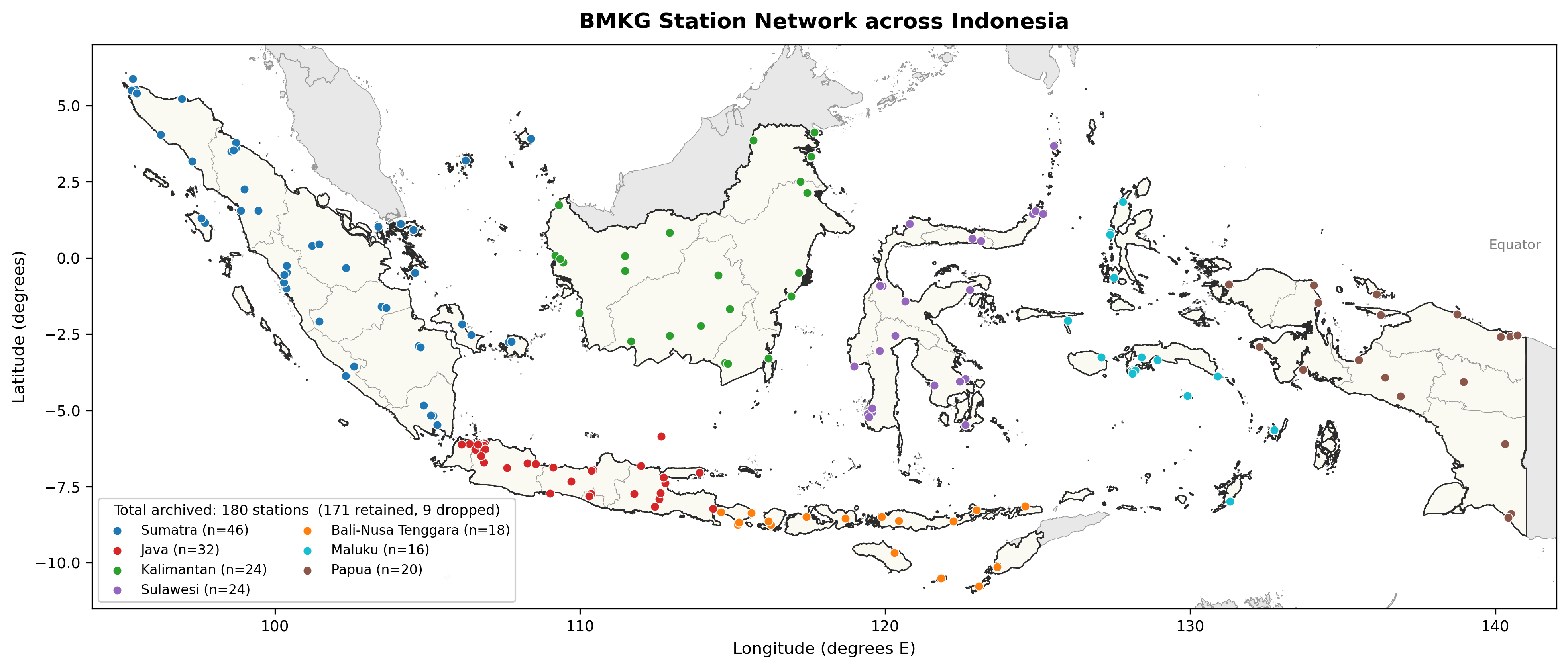{#fig-station-network fig-align="center"}Not every archived station enters the validation. Two filters are applied before any metric is computed: a station must fall on the 0.1 deg land mask, and it must have at least 30 paired days per dekadal window. This takes the set from 180 archived stations to **172 validated** across all seven regions.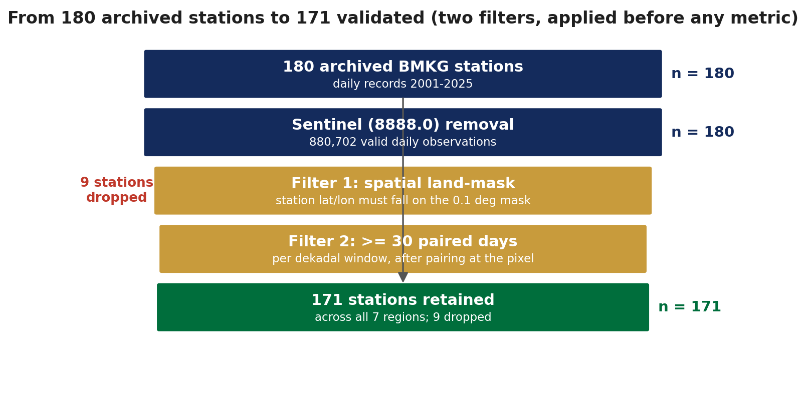{#fig-validation-funnel fig-align="center"}## Overview: what improvesThe headline result, evaluated at the 172 independent stations, is a clear win on the **mean, variability, and extremes**: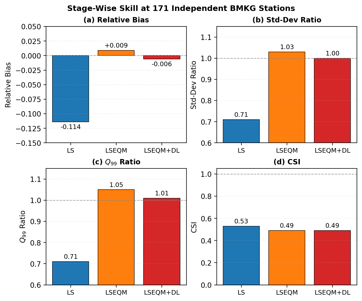{#fig-headline fig-align="center"}Interactive version (same numbers; hover for values, dashed line marks the target):```{ojs}//| echo: falseheadline = [ {metric: "Relative bias", target: 0, LS: -0.114, LSEQM: 0.009, "LSEQM+DL": -0.006}, {metric: "Std-dev ratio", target: 1, LS: 0.71, LSEQM: 1.03, "LSEQM+DL": 1.00}, {metric: "Q99 ratio", target: 1, LS: 0.71, LSEQM: 1.05, "LSEQM+DL": 1.01}, {metric: "CSI", target: 1, LS: 0.53, LSEQM: 0.49, "LSEQM+DL": 0.49}].flatMap(r => ["LS", "LSEQM", "LSEQM+DL"].map(m => ({metric: r.metric, target: r.target, method: m, value: r[m]})))Plot.plot({ width: 880, height: 360, marginLeft: 50, facet: {data: headline, x: "metric"}, x: {label: null, tickRotate: 0}, y: {grid: true, label: "value"}, color: {legend: true, domain: ["LS", "LSEQM", "LSEQM+DL"], range: ["#3b78b0", "#f39c12", "#27ae60"]}, marks: [ Plot.barY(headline, {x: "method", y: "value", fill: "method", fx: "metric"}), Plot.ruleY(headline, {fy: null, y: "target", fx: "metric", stroke: "#444", strokeDasharray: "4 3"}), Plot.ruleY([0]), Plot.tip(headline, Plot.pointer({x: "method", y: "value", fx: "metric", title: d => `${d.method}\n${d.metric} = ${d.value}`})) ]})```- **Relative bias** moves from -0.114 (LS undercorrects the mean) to +0.009 (LSEQM) and -0.006 (LSEQM+DL): near-zero after distribution correction.- **Standard-deviation ratio** moves from 0.71 (raw/LS is too smooth) to 1.03 (LSEQM) and 1.00 (LSEQM+DL): variability restored.- **Q99 ratio** moves from 0.71 to 1.05 (LSEQM) and 1.01 (LSEQM+DL): the extreme tail is recovered.- **CSI** stays around 0.49-0.53 across stages: categorical detection is set early and the later stages do not change it much.Detection skill, broken out by intensity threshold, shows the same story: LS already does most of the categorical work at light thresholds, and skill degrades with intensity as expected for daily satellite precipitation.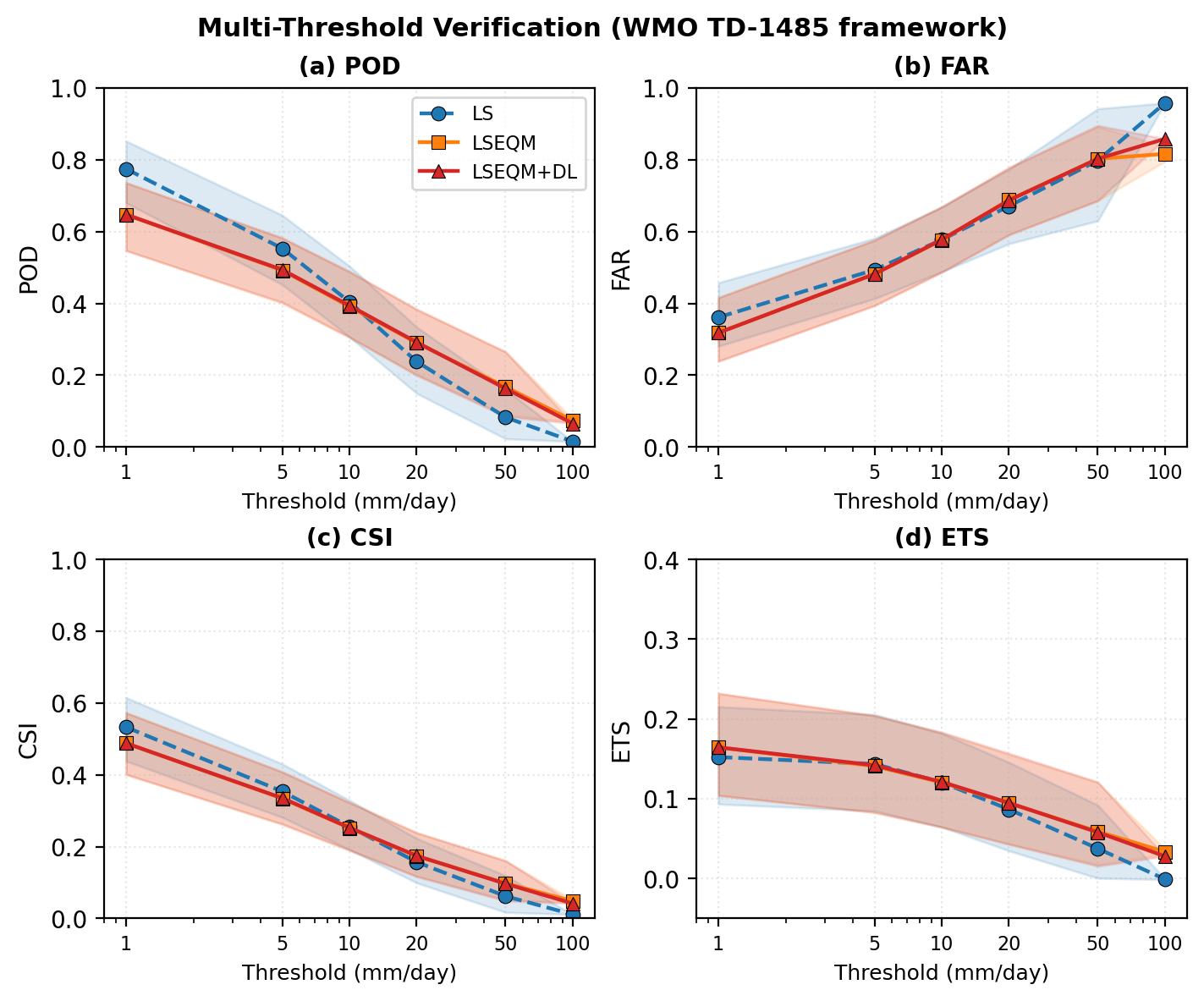{#fig-multi-threshold fig-align="center"}The static figure above pools the climatology. The version below is interactive: pick a dekad and a score to see how the three methods compare across intensity thresholds for that specific 10-day window. Shaded bands are the inter-quartile range across stations; points drop out at high thresholds where too few stations record enough events to pass the WMO/TD-1485 minimum (see the [FAQ](../faq.qmd#why-does-the-bali-multi-threshold-curve-only-show-up-to-50-mm-where-are-the-100-and-150-mm-points)).```{ojs}//| echo: falsemt = FileAttachment("../data/case-studies/multithreshold.csv").csv({typed: true})``````{ojs}//| echo: falsemtPeriods = new Map( Array.from(new Set(mt.map(d => d.month * 10 + d.dekad))) .sort((a, b) => a - b) .map(k => { const mo = Math.floor(k / 10), dk = k % 10; const name = ["Jan","Feb","Mar","Apr","May","Jun","Jul","Aug","Sep","Oct","Nov","Dec"][mo - 1]; const span = dk === 1 ? "d1 (1-10)" : dk === 2 ? "d2 (11-20)" : "d3 (21-end)"; return [`${name} ${span}`, {month: mo, dekad: dk}]; }))viewof mtPeriod = Inputs.select(mtPeriods, {label: "Dekad", value: mtPeriods.get("Jan d2 (11-20)")})``````{ojs}//| echo: falsemtMetrics = new Map([ ["POD - probability of detection (higher better)", {key: "pod", dir: "higher"}], ["CSI - critical success index (higher better)", {key: "csi", dir: "higher"}], ["ETS - equitable threat score (higher better)", {key: "ets", dir: "higher"}], ["FAR - false-alarm ratio (lower better)", {key: "far", dir: "lower"}], ["HSS - Heidke skill score (higher better)", {key: "hss", dir: "higher"}], ["HK - Hanssen-Kuipers (higher better)", {key: "hk", dir: "higher"}]])viewof mtMetric = Inputs.select(mtMetrics, {label: "Score", value: mtMetrics.get("CSI - critical success index (higher better)")})``````{ojs}//| echo: false{ const k = mtMetric.key; const sub = mt.filter(d => d.month === mtPeriod.month && d.dekad === mtPeriod.dekad && d[k] != null); if (!sub.length) return html`<em>No verified stations for this dekad/score.</em>`; return Plot.plot({ width: 880, height: 420, marginLeft: 55, x: {type: "log", label: "Threshold (mm/day)", domain: [1, 160], ticks: [1, 5, 10, 20, 50, 100, 150], tickFormat: d => d}, y: {label: mtMetric.key.toUpperCase() + " (median across stations)", grid: true, domain: [0, 1]}, color: {legend: true, domain: ["LS", "LSEQM", "LSEQM+DL"], range: ["#3b78b0", "#f39c12", "#27ae60"]}, marks: [ Plot.areaY(sub.filter(d => d[k + "_lo"] != null), {x: "threshold", y1: k + "_lo", y2: k + "_hi", fill: "method", fillOpacity: 0.12, curve: "catmull-rom"}), Plot.line(sub, {x: "threshold", y: k, stroke: "method", strokeWidth: 2, curve: "catmull-rom"}), Plot.dot(sub, {x: "threshold", y: k, fill: "method", r: 3.2}), Plot.tip(sub, Plot.pointer({x: "threshold", y: k, stroke: "method", title: d => `${d.method}\n${d.threshold} mm (${d.label})\n${mtMetric.key.toUpperCase()} = ${d[k].toFixed(3)}`})) ] });}```Reading it: at light thresholds (1-10 mm) all three methods sit close together - LS already captures most wet-day detection. The methods separate little even at heavier thresholds, because categorical detection depends on *when* it rains (timing the satellite sets), not on the distribution reshaping that LSEQM applies. This is the categorical face of the same [correlation ceiling](#the-correlation-ceiling).The Taylor diagram summarises correlation, variability, and centred RMSE in one view, split by season. The bias-corrected products pull the variability ratio toward the reference, while correlation stays in the same band - the pattern explained in [the correlation ceiling](#the-correlation-ceiling) below.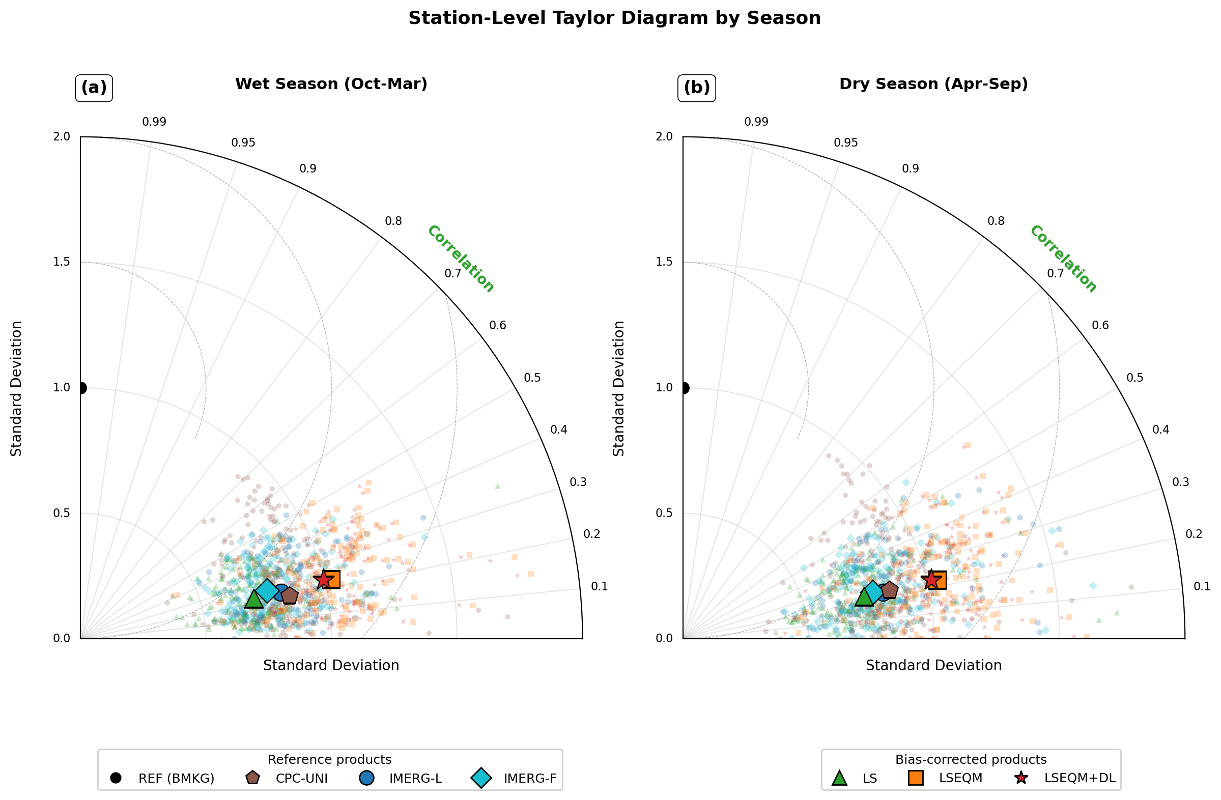{#fig-taylor fig-align="center"}## Spatial skillMapped across the archipelago, the Continuous Quality Index (CQI) is spatially coherent for all three methods, and sits in the **Fair** band on the [QA tier scale](../tutorials/qa-framework.qmd) (0.40 to 0.60: improves on the raw satellite, significant biases remain) rather than the Good band. The honest finding is that the **median CQI does not rise** from LS (0.541) to LSEQM (0.505) to LSEQM+DL (0.508):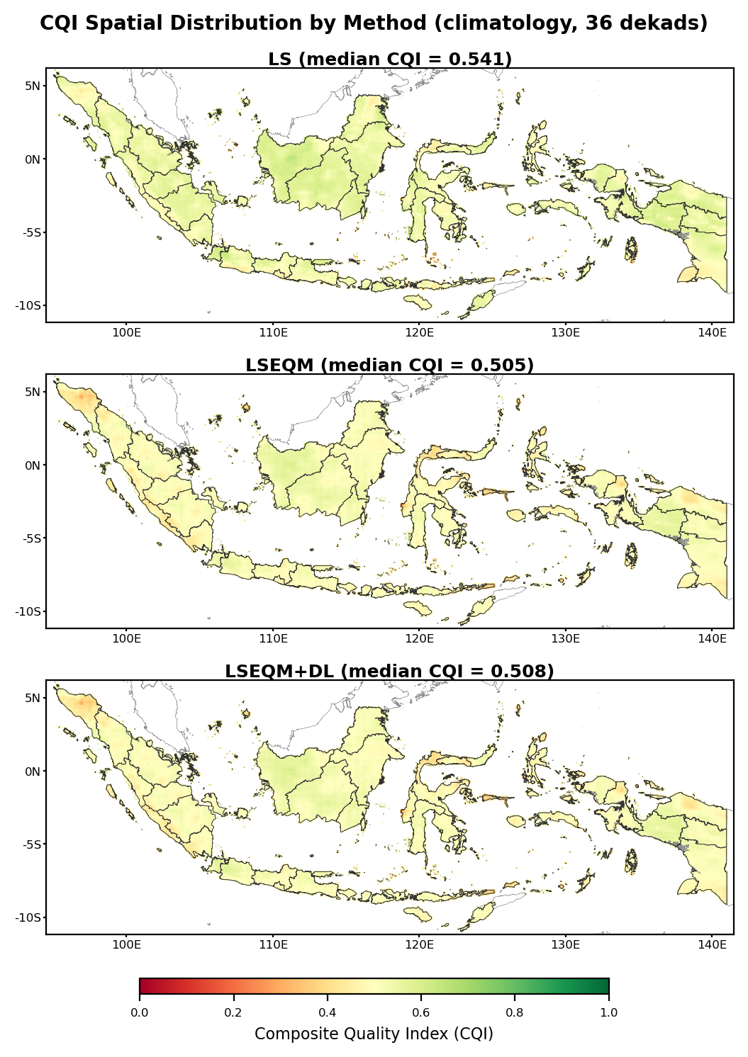{#fig-cqi-spatial fig-align="center"}This is not a defect, and it is worth stating plainly. The CQI weights the basic-statistics component at 0.4, and that component is relative bias (0.30), RMSE (0.30) and NSE (0.40). Pearson correlation is deliberately not in it, because NSE already carries the linear-association term. Because those timing-sensitive metrics do not improve under marginal bias correction - and RMSE slightly worsens when EQM restores variance against a mistimed series - the composite index does not reward the distribution and extreme gains that LSEQM delivers. The improvement map makes the trade explicit: relative to LS, LSEQM+DL lowers CQI at most pixels.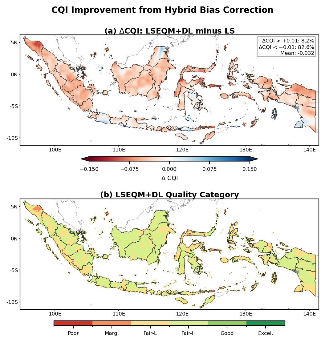{#fig-cqi-improvement fig-align="center"}The takeaway: **choose the product by what you need.** If you need the right distribution and extremes (most hydrological and risk applications), LSEQM / LSEQM+DL is the right choice despite the flat composite index. If you only need the basic mean field and nothing else, LS is competitive.Skill is stable across the seasonal cycle and does not collapse in any region: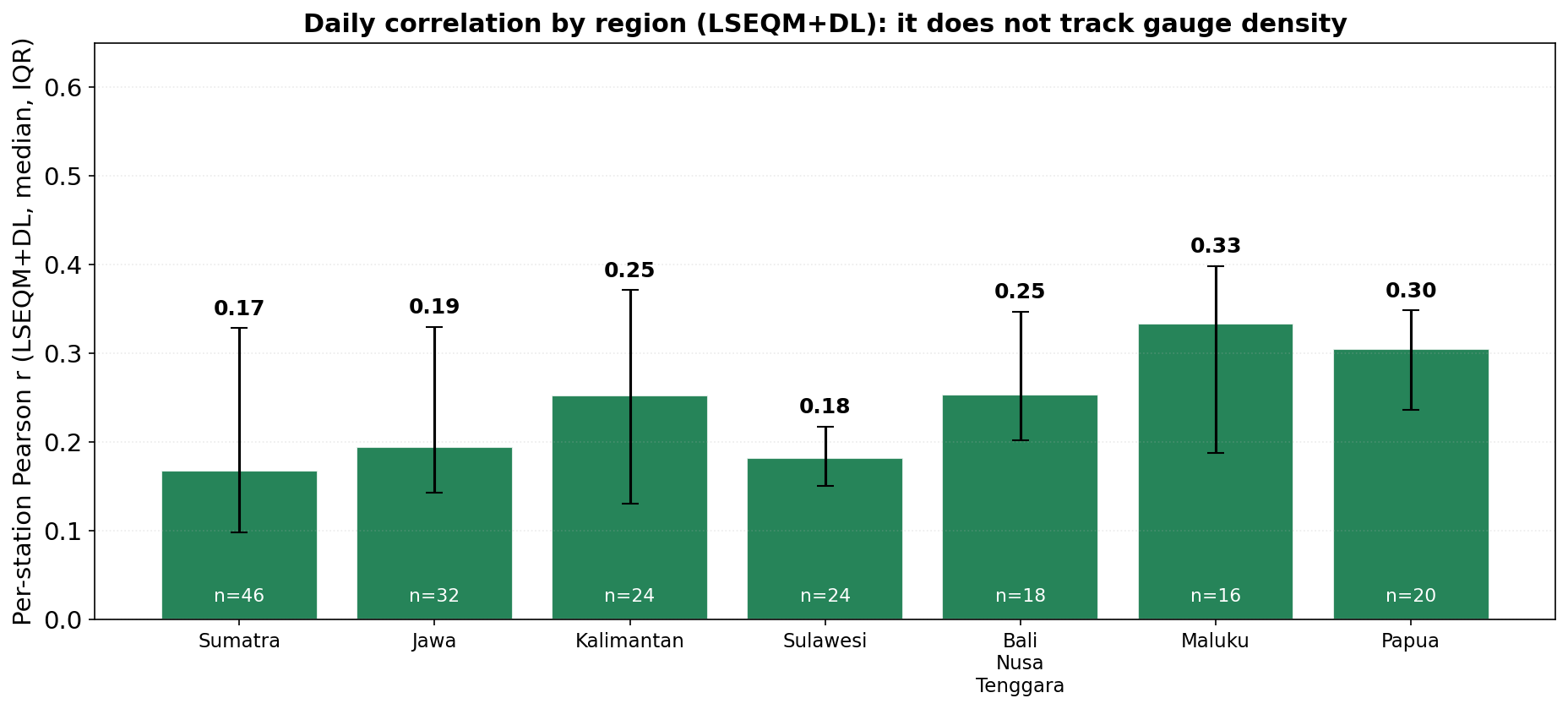{fig-align="center"}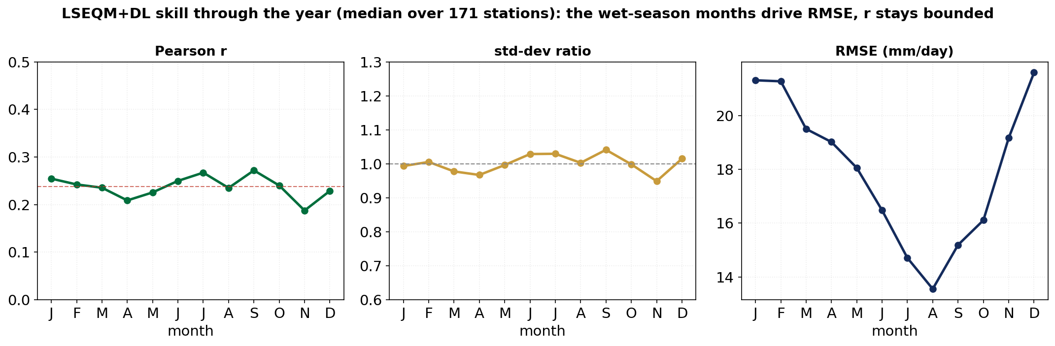{fig-align="center"}The interactive version below is computed live from the 175-station metadata (2001-2021). Pick a metric and product; bars are the regional median, whiskers the inter-quartile range across stations in each region:```{ojs}//| echo: falseregOptions = new Map([ ["Pearson r", {imergl: "imergl_r", lseqmdl: "lseqmdl_r"}], ["Relative bias", {imergl: "imergl_bias", lseqmdl: "lseqmdl_bias"}], ["RMSE (mm/day)", {imergl: "imergl_rmse", lseqmdl: "lseqmdl_rmse"}], ["NSE", {imergl: "imergl_nse", lseqmdl: "lseqmdl_nse"}], ["Correct-dry rate", {imergl: "correctdry_imergl", lseqmdl: "correctdry_lseqmdl"}], ["Wet-day frequency ratio", {imergl: "wetfreq_imergl", lseqmdl: "wetfreq_lseqmdl"}]])viewof regMetricName = Inputs.select([...regOptions.keys()], {label: "Metric", value: "Pearson r"})``````{ojs}//| echo: falseviewof regProduct = Inputs.radio(new Map([["IMERG-L (raw)", "imergl"], ["LSEQM+DL", "lseqmdl"]]), {label: "Product", value: "lseqmdl"})``````{ojs}//| echo: false{ const col = regOptions.get(regMetricName)[regProduct]; const order = ["Sumatra", "Jawa", "Kalimantan", "Sulawesi", "Bali Nusa Tenggara", "Maluku", "Papua"]; const byReg = d3.groups(meta.filter(d => d[col] != null && Number.isFinite(d[col])), d => d.region) .map(([region, rows]) => { const vals = rows.map(r => r[col]).sort(d3.ascending); return {region, n: rows.length, med: d3.median(vals), lo: d3.quantile(vals, 0.25), hi: d3.quantile(vals, 0.75)}; }) .sort((a, b) => order.indexOf(a.region) - order.indexOf(b.region)); return Plot.plot({ width: 880, height: 360, marginBottom: 80, x: {label: null, tickRotate: -25, domain: order}, y: {grid: true, label: regMetricName}, marks: [ Plot.ruleY([0]), Plot.barY(byReg, {x: "region", y: "med", fill: "#27ae60", fillOpacity: 0.85}), Plot.ruleX(byReg, {x: "region", y1: "lo", y2: "hi", stroke: "#145a32", strokeWidth: 2}), Plot.text(byReg, {x: "region", y: "med", text: d => d.med?.toFixed(2), dy: -8, fontSize: 10}), Plot.text(byReg, {x: "region", y: 0, text: d => `n=${d.n}`, dy: 14, fontSize: 9, fill: "#666"}) ] });}```One point from the regional breakdown: daily correlation does **not** track gauge density. Read off the chart above, the regional medians of per-station daily Pearson r against the BMKG gauges (LSEQM+DL, native window, whole 2001-2021 record, 175-station explorer set) span about 0.18 to 0.37. That range is a live reading of the explorer data on this page, not a headline validation figure. Maluku and Papua, with far fewer stations than Java, are not systematically worse. This tells us the ceiling on daily correlation is set by something other than how many gauges are nearby - again, see below.## Extreme valuesThe GPD tail graft is designed to recover heavy-rain behaviour. Across stations, the corrected-to-gauge ratio at heavy thresholds (20, 50, 100 mm/day) moves toward 1.0 where LS alone leaves a deficit: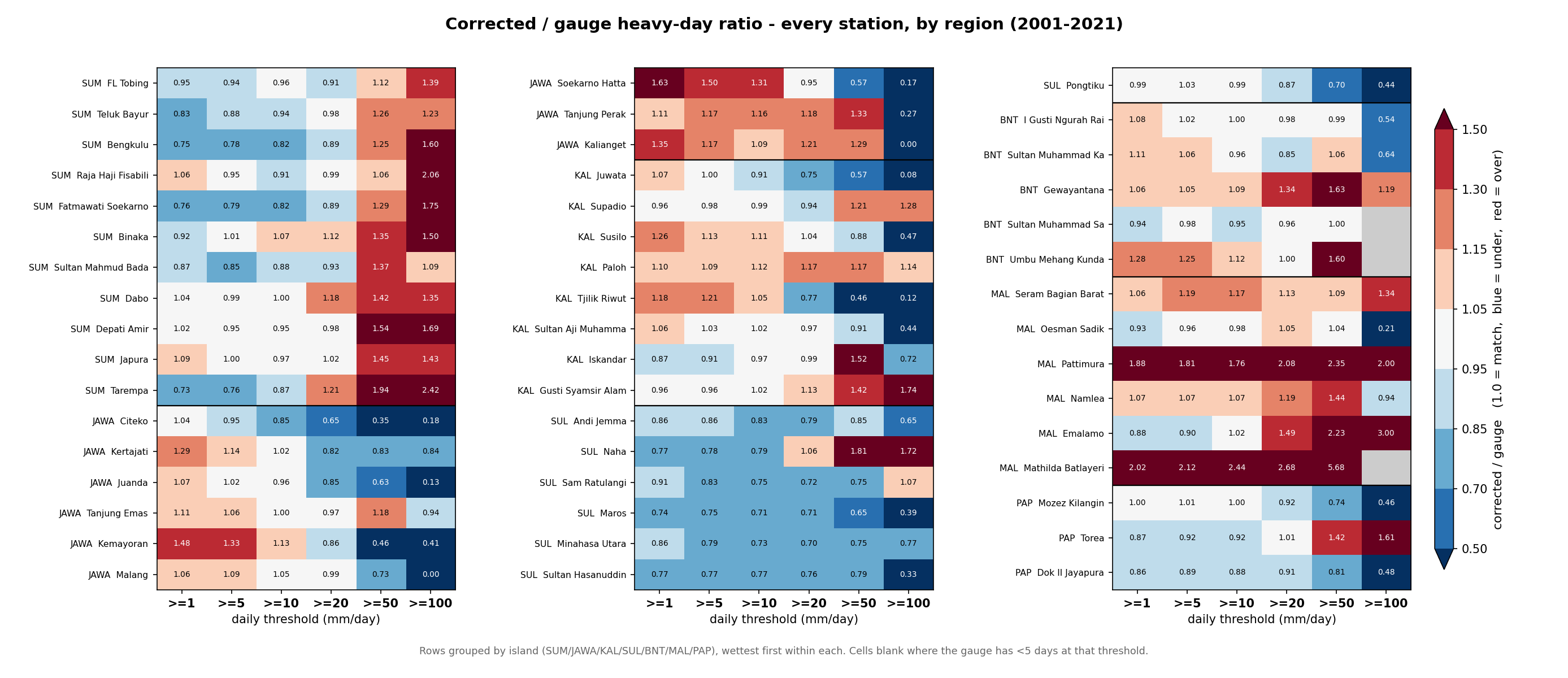{#fig-extremes-ratio fig-align="center"}Interactive version below: pick a product and region. Each cell is the ratio of product to gauge heavy-day counts (counted on gauge-valid days only); **white is a perfect match (1.0)**, blue is under-detection, red is over-detection. Cells are blank where fewer than 5 gauge events make the ratio unreliable. Toggle IMERG-L vs LSEQM+DL to watch the heavy-rain deficit (blue) close toward white after correction.```{ojs}//| echo: falseextremes = FileAttachment("../data/case-studies/extremes_ratio.csv").csv({typed: true})``````{ojs}//| echo: falseviewof exProduct = Inputs.radio(["IMERG-L", "LSEQM+DL"], {label: "Product", value: "LSEQM+DL"})``````{ojs}//| echo: falseviewof exRegion = Inputs.select( ["All regions", "Sumatra", "Jawa", "Kalimantan", "Sulawesi", "Bali Nusa Tenggara", "Maluku", "Papua"], {label: "Region", value: "Jawa"})``````{ojs}//| echo: false{ let sub = extremes.filter(d => d.product === exProduct); if (exRegion !== "All regions") sub = sub.filter(d => d.region === exRegion); sub = sub.map(d => ({...d, label: `${d.name} (${d.wmo})`})); const order = [...new Set( sub.slice().sort((a, b) => d3.ascending(a.region, b.region) || d3.descending(a.lat, b.lat)).map(d => d.label) )]; const h = 70 + order.length * 13; return Plot.plot({ width: 720, height: h, marginLeft: 175, marginBottom: 45, x: {type: "band", domain: [1, 5, 10, 20, 50, 100], label: "Threshold (mm/day)", tickFormat: d => d + " mm"}, y: {domain: order, label: null}, color: {type: "diverging", scheme: "RdBu", pivot: 1, reverse: true, domain: [0.5, 1.5], clamp: true, legend: true, label: `${exProduct} / gauge heavy-day ratio`}, marks: [ Plot.cell(sub, {x: "threshold", y: "label", fill: "ratio", inset: 0.5, tip: true, channels: {Region: "region", "n events": "n_gauge", ratio: "ratio"}}) ] });}```The same correction read as detection and intensity metrics for heavy days: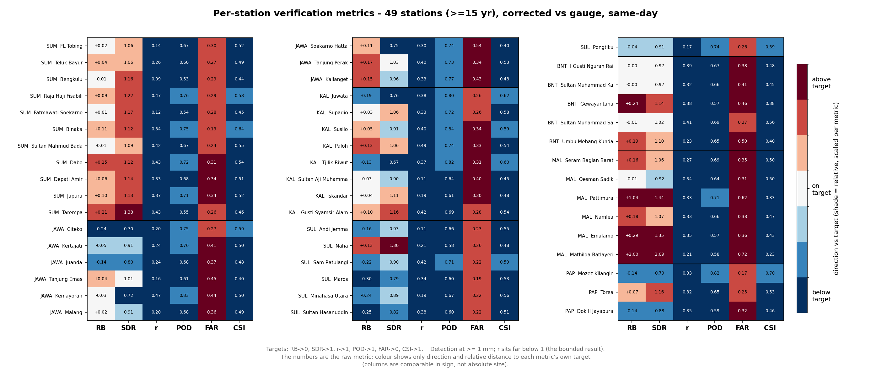{#fig-extremes-metrics fig-align="center"}And as a calendar view of where and when the heaviest events land after LSEQM+DL correction: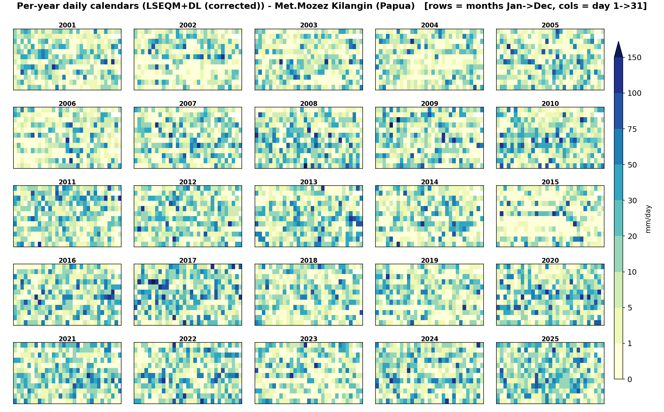{#fig-extremes-calendar fig-align="center"}### Event-level view, by stationZooming all the way in: the daily series around each station's heaviest rain days, comparing the gauge with the raw and corrected products. Pick a station to see how the correction handles its biggest events. These six span the archipelago, from Aceh to Papua.```{ojs}//| echo: falseexEventStations = new Map([ ["FL Tobing - North Sumatra", "fltobing"], ["Malikussaleh - Aceh", "malikussaleh"], ["Bima - West Nusa Tenggara", "bima"], ["Betoambari - Southeast Sulawesi", "betoambari"], ["Sultan Aji (Balikpapan) - Kalimantan", "sultanaji"], ["Timika - Papua", "timika"]])viewof exEventStn = Inputs.select(exEventStations, {label: "Station", value: "timika"})``````{ojs}//| echo: falsehtml`<img src="extremes-events/${exEventStn}.png" alt="Extreme-event series" style="width:100%;max-width:1000px;display:block;margin:0 auto;">````## The correlation ceilingThis is the central diagnostic of the study, and the most important thing the framework reveals about daily satellite precipitation.Under marginal bias correction, **Pearson correlation barely moves**. Against the **CPC-UNI calibration reference** (daily, native window, per-pixel spatial median over land, and therefore in-sample), it goes 0.343 (LS) to 0.345 (LSEQM) to 0.348 (LSEQM+DL), a shift of +0.005. Against the **independent BMKG stations**, built the same way, the same correlation is lower and just as flat: 0.242 (LS), 0.236 (LSEQM), 0.239 (LSEQM+DL). RMSE and NSE do not improve either. Only the distribution-shape metrics (SDR, Q99) move to target.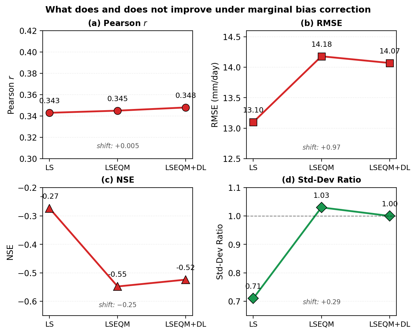{#fig-paradox fig-align="center"}Interactive version - each panel has its own y-axis so the *shape* of the trajectory is what matters. Watch Pearson r stay almost flat while the std-dev ratio climbs to its target. The panels do not share a reference and the labels say which is which: the first three are per-pixel against CPC-UNI (in-sample), the std-dev ratio is per-station against the independent BMKG stations. Against CPC-UNI the std-dev ratio does not converge on 1.0, it overshoots (0.97 to 1.16 to 1.15), so the two references must not be read as one story.```{ojs}//| echo: falseparadox = [ {metric: "Pearson r (vs CPC-UNI)", LS: 0.343, LSEQM: 0.345, "LSEQM+DL": 0.348}, {metric: "RMSE mm/day (vs CPC-UNI)", LS: 13.10, LSEQM: 14.18, "LSEQM+DL": 14.07}, {metric: "NSE (vs CPC-UNI)", LS: -0.27, LSEQM: -0.55, "LSEQM+DL": -0.52}, {metric: "Std-dev ratio (vs BMKG)", LS: 0.71, LSEQM: 1.03, "LSEQM+DL": 1.00}].flatMap(r => ["LS", "LSEQM", "LSEQM+DL"].map(m => ({metric: r.metric, method: m, value: r[m]})))Plot.plot({ width: 880, height: 320, marginLeft: 55, facet: {data: paradox, x: "metric"}, fx: {label: null}, x: {domain: ["LS", "LSEQM", "LSEQM+DL"], label: null}, y: {grid: true, label: "value"}, marks: [ Plot.line(paradox, {fx: "metric", x: "method", y: "value", stroke: "#c0392b", strokeWidth: 2}), Plot.dot(paradox, {fx: "metric", x: "method", y: "value", fill: "#c0392b", r: 4}), Plot.tip(paradox, Plot.pointer({fx: "metric", x: "method", y: "value", title: d => `${d.metric}\n${d.method} = ${d.value}`})) ]})```Placing every product in the same two-axis skill space makes the pattern unmistakable. The horizontal axis is timing (Pearson r, per pixel against CPC-UNI); the vertical axis is spread (standard-deviation ratio, per station against the independent BMKG network). Each correction stage moves products *vertically* - EQM lifts the spread ratio onto the gauge target - while they all stay pinned on the same vertical line of low correlation. No stage moves toward the r = 1 target on the right.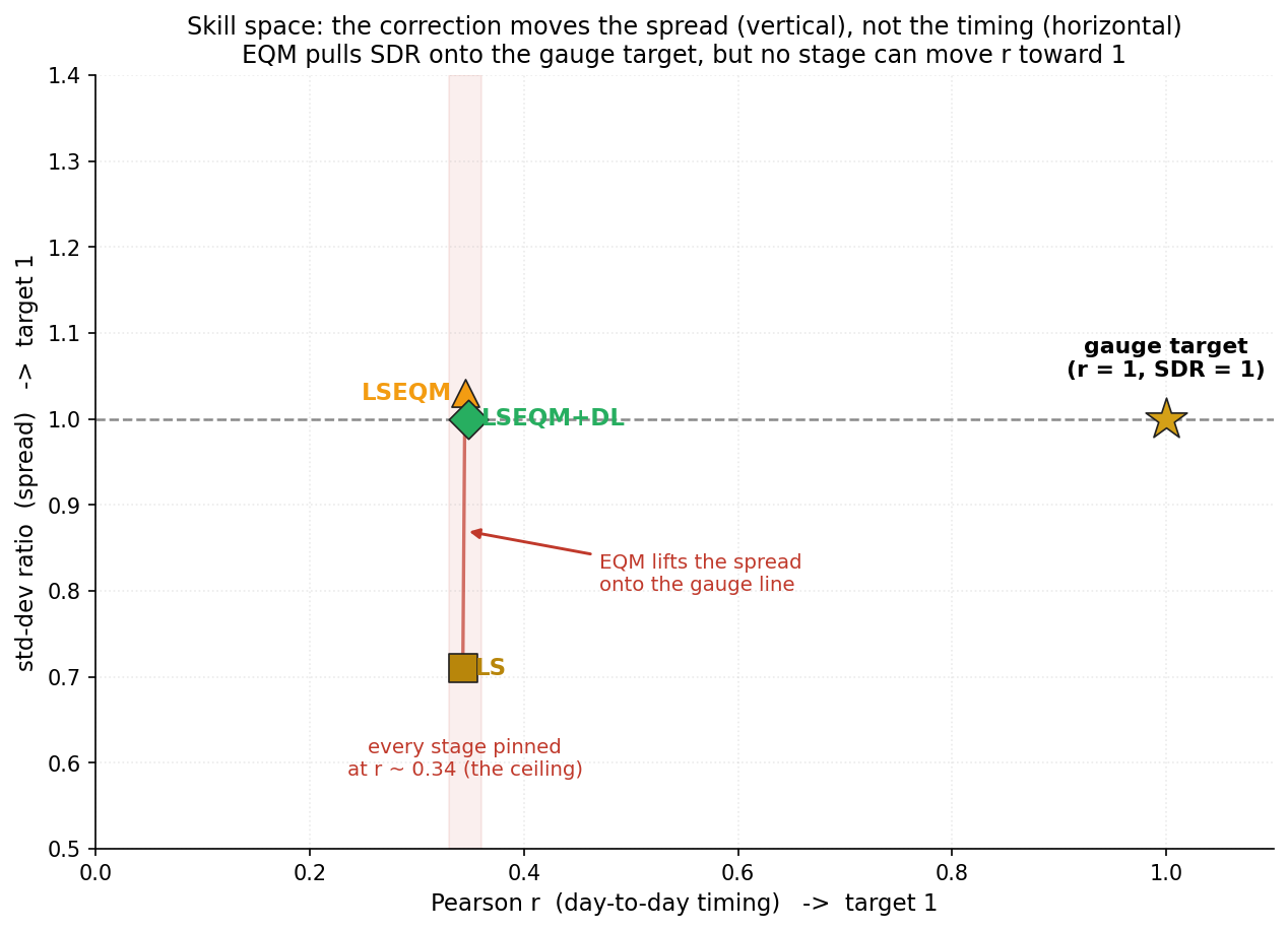{#fig-skill-space fig-align="center"}The reason is structural, not a failure of the method. Quantile mapping is a monotone non-decreasing transform applied per pixel: it changes the *values* and introduces no rank reversals, so the day-to-day *ordering* inherited from the satellite survives largely intact. The exception is dry-day matching, which ties about 43% of days at zero and does reshuffle the pairing slightly. So once LS has set the rank structure, distribution correction leaves Pearson r pinned close to the value the satellite's own day-to-day timing sets, moving it only within sampling noise.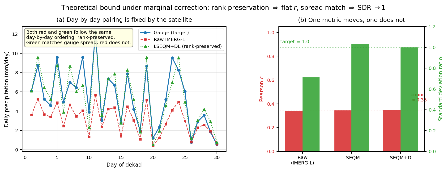{#fig-bound fig-align="center"}The rank argument is not just theory. Tracing every day's global rank through the four pipeline stages, the lines stay almost perfectly horizontal: LS and EQM introduce no rank reversals (dry-day tying aside), and the CNN adds only tiny perturbations. With the ordering left largely intact, correlation moves only within sampling noise.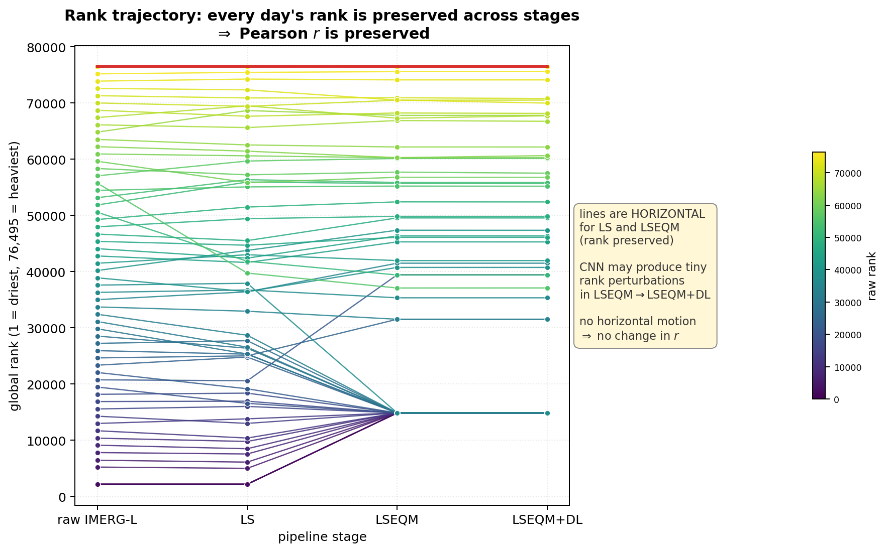{#fig-rank-trajectory fig-align="center"}### Where the ceiling comes fromA natural question is whether the ceiling is intrinsic to the satellite retrieval, or an artefact of how the data are aligned in time. IMERG accumulates on a UTC day; a BMKG gauge "day" is a local-morning-to-morning window. Indonesia spans three time zones, so the satellite day and the gauge day are offset by hours.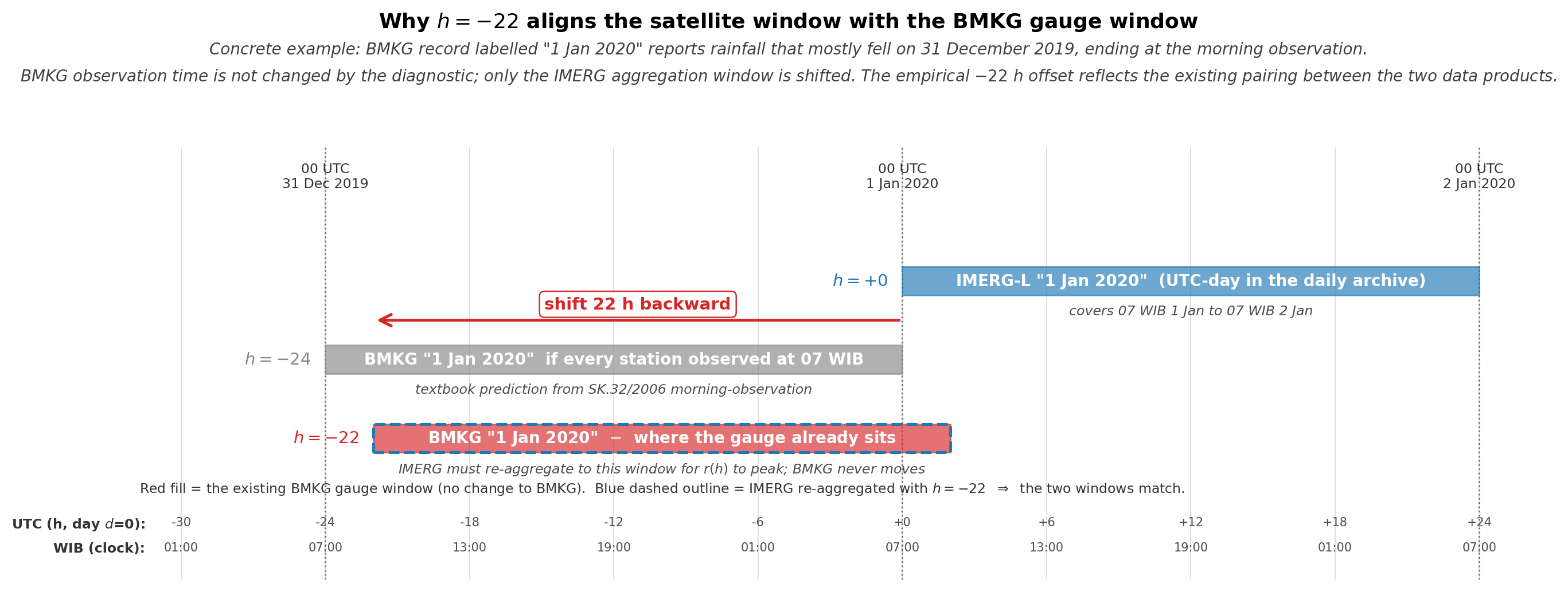{#fig-subdaily-timing fig-align="center"}Shifting the satellite accumulation window and recomputing correlation reveals a clear peak well away from zero offset. Against the independent BMKG stations, the single pooled daily correlation rises from **0.20** at the native UTC-day alignment the archive uses (h = 0) to **0.57** at the harmonised window (h = -23, a 23-hour backward shift).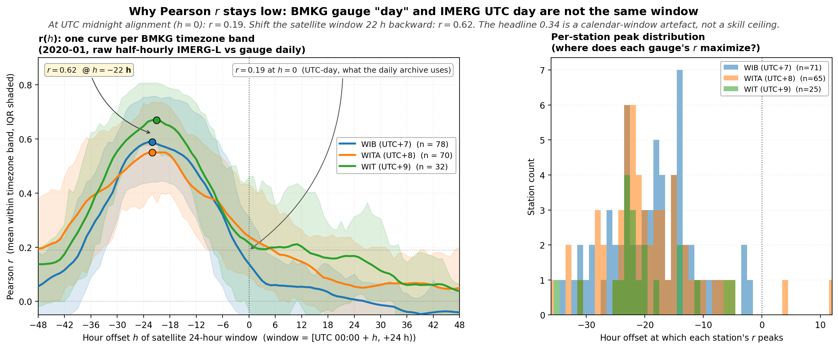{#fig-subdaily-lag fig-align="center"}The optimal offset is spatially organised by time zone, confirming it is a real timing-window effect and not noise: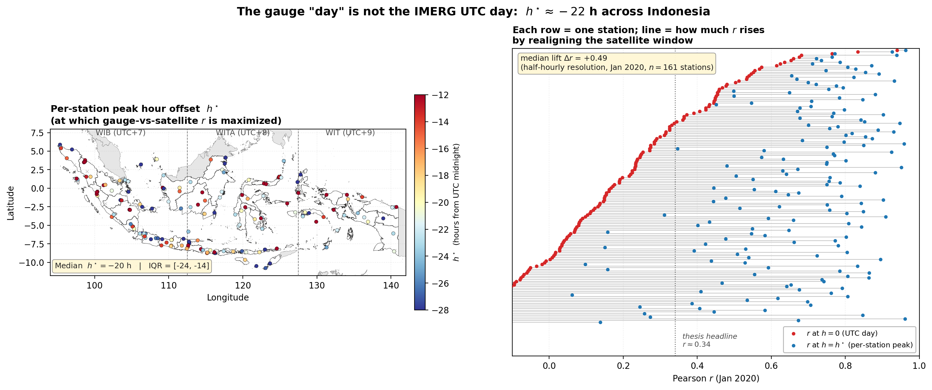{#fig-subdaily-map fig-align="center"}Repeating the window search at every station individually confirms it is not a pooled artefact. At the harmonised window the typical station reaches a daily correlation of **0.56** (the median of the per-station peak r over the 178 stations with half-hourly coverage, inter-quartile range 0.51 to 0.62, GPM era 2015-2021), in line with the 0.57 single pooled value above and far above the 0.20 pooled at the native UTC alignment. The timing limit is a window mismatch, not irreducible noise.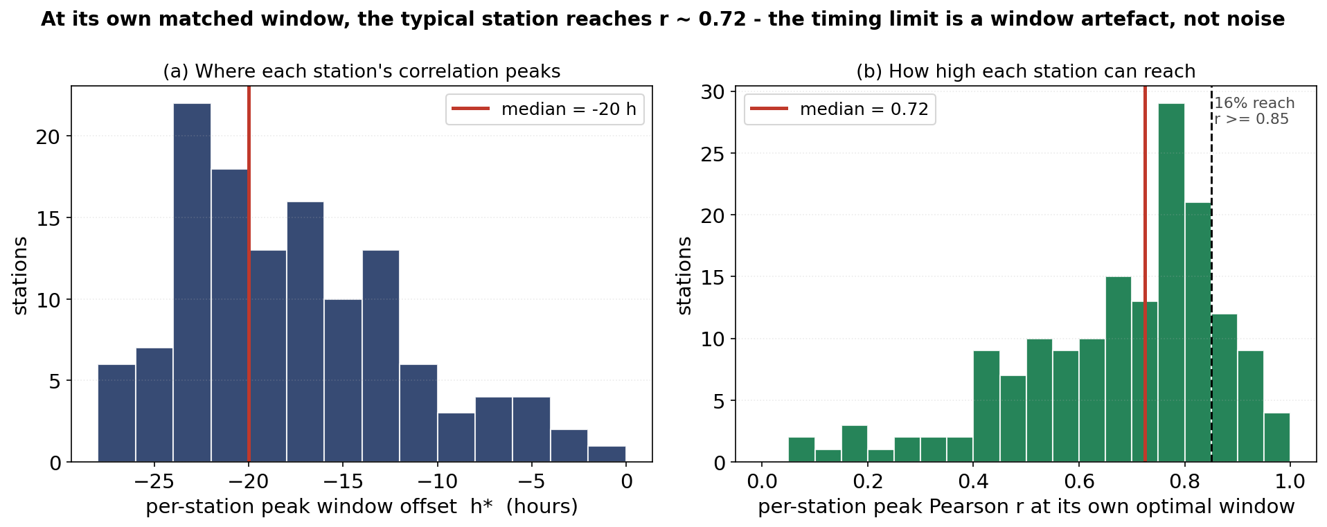{#fig-subdaily-peak fig-align="center"}Harmonising the accumulation window therefore lifts the pooled daily correlation against the independent stations from 0.20 to 0.57, so a large part of the apparent timing ceiling is a **calendar-window artefact** (fixable by aligning the accumulation window to the local day) rather than irreducible retrieval error. This is a methodological caveat that applies to any daily verification of UTC-accumulated satellite precipitation against locally-defined gauge days, not just this framework.::: {.callout-important}The practical implication: do not judge daily satellite precipitation - corrected or raw - on Pearson r alone. A low daily r is partly a timing-window artefact. Judge the correction on the distribution and extreme metrics, which is what the bias correction can actually move, and re-aggregate or re-window before computing correlation if timing fidelity matters for your application.:::## All-station summary### Explore any stationThe chart below is interactive. Pick a station and a year to see the daily series for the gauge, raw IMERG-L, and the corrected LSEQM+DL product, with skill metrics for the selected station updating alongside.::: {.callout-note collapse="true"}## About this dataThis explorer covers **175 stations** over the **full 2001-2021 record** - every BMKG station with at least one full year of valid gauge data (close to the 172 validated in the headline pipeline; the small difference is a simpler completeness filter). Completeness varies by station and is shown in the dropdown and on the map - sparse stations have visible gaps in the daily series. Each station's daily record (~120 KB) is fetched only when you select it, so the page stays light. Per-station metrics are computed over 2001-2021, so they are close to but not identical to the headline figures above (which use the full pipeline's pairing rules).:::```{ojs}//| echo: falsemeta = FileAttachment("../data/case-studies/station_meta.csv").csv({typed: true})``````{ojs}//| echo: falsestationOptions = new Map( meta .slice() .sort((a, b) => d3.ascending(a.region, b.region) || d3.ascending(a.name, b.name)) .map(d => [`${d.region} - ${d.name} (${d.wmo}) - ${d.completeness}% complete`, String(d.wmo)]))viewof wmo = Inputs.select(stationOptions, {label: "Station", value: "96073"})``````{ojs}//| echo: false// Each station's full 2001-2021 daily record is fetched on demand (~150 KB).stationRows = d3.csv(`station-data/${wmo}.csv`, d3.autoType)``````{ojs}//| echo: falseyearsAvailable = Array.from(new Set(stationRows.map(d => d.date.getUTCFullYear()))).sort((a, b) => a - b)viewof year = Inputs.select(yearsAvailable, {label: "Year", value: yearsAvailable[yearsAvailable.length - 1]})``````{ojs}//| echo: falseplotRows = stationRows.filter(d => d.date.getUTCFullYear() === year)``````{ojs}//| echo: falseseries = ["gauge", "imergl", "lseqmdl"].flatMap(k => plotRows.map(d => ({date: d.date, value: d[k], product: ({gauge: "Gauge (BMKG)", imergl: "IMERG-L (raw)", lseqmdl: "LSEQM+DL"})[k]}))).filter(d => d.value != null && Number.isFinite(d.value))Plot.plot({ width: 920, height: 380, marginLeft: 55, x: {label: "Date", type: "utc"}, y: {label: "Daily precipitation (mm/day)", grid: true, zero: true}, color: { legend: true, domain: ["Gauge (BMKG)", "IMERG-L (raw)", "LSEQM+DL"], range: ["#222222", "#9aa0a6", "#27ae60"] }, marks: [ Plot.ruleY([0]), Plot.line(series, {x: "date", y: "value", stroke: "product", strokeWidth: 1.3, curve: "linear"}), Plot.tip(series, Plot.pointer({x: "date", y: "value", stroke: "product", title: d => `${d.product}\n${d.date.toISOString().slice(0,10)}\n${d.value.toFixed(1)} mm/day`})) ]})``````{ojs}//| echo: falseselMeta = meta.find(d => String(d.wmo) === String(wmo))fmt = (x, d=2) => (x == null || Number.isNaN(x)) ? "n/a" : x.toFixed(d)html`<table class="table table-sm" style="max-width:640px"> <thead><tr><th>Metric (2001-2021)</th><th>IMERG-L (raw)</th><th>LSEQM+DL</th><th>Target</th></tr></thead> <tbody> <tr><td>Pearson r</td><td>${fmt(selMeta.imergl_r)}</td><td>${fmt(selMeta.lseqmdl_r)}</td><td>1.0</td></tr> <tr><td>RMSE (mm/day)</td><td>${fmt(selMeta.imergl_rmse,1)}</td><td>${fmt(selMeta.lseqmdl_rmse,1)}</td><td>0</td></tr> <tr><td>NSE</td><td>${fmt(selMeta.imergl_nse)}</td><td>${fmt(selMeta.lseqmdl_nse)}</td><td>1.0</td></tr> <tr><td>Relative bias</td><td>${fmt(selMeta.imergl_bias)}</td><td>${fmt(selMeta.lseqmdl_bias)}</td><td>0</td></tr> <tr><td>Paired days</td><td colspan="2">${selMeta.lseqmdl_n}</td><td></td></tr> </tbody></table>````The same station as a scatter against the gauge (all paired days, 2001-2021), raw IMERG-L on the left and corrected LSEQM+DL on the right. Points on the dashed 1:1 line are perfect agreement. Hover any point for its date and values. The corrected cloud sits closer to the diagonal and recovers the heavy-rain points that raw IMERG-L compresses toward the axis:```{ojs}//| echo: falsescatterData = stationRows.flatMap(d => [ {gauge: d.gauge, value: d.imergl, product: "IMERG-L (raw)", date: d.date}, {gauge: d.gauge, value: d.lseqmdl, product: "LSEQM+DL", date: d.date}]).filter(d => Number.isFinite(d.gauge) && Number.isFinite(d.value))scatterMax = Math.max(10, d3.max(scatterData, d => Math.max(d.gauge, d.value)) ?? 10)Plot.plot({ width: 920, height: 440, marginLeft: 55, grid: true, aspectRatio: 1, facet: {data: scatterData, x: "product"}, x: {label: "Gauge (mm/day)", domain: [0, scatterMax]}, y: {label: "Product (mm/day)", domain: [0, scatterMax]}, color: {domain: ["IMERG-L (raw)", "LSEQM+DL"], range: ["#9aa0a6", "#27ae60"]}, marks: [ Plot.line([[0, 0], [scatterMax, scatterMax]], {stroke: "#888", strokeDasharray: "4 3"}), Plot.dot(scatterData, {x: "gauge", y: "value", r: 1.6, fill: "product", fillOpacity: 0.25}), Plot.dot(scatterData, Plot.pointer({x: "gauge", y: "value", r: 4, fill: "product", stroke: "#111"})), Plot.tip(scatterData, Plot.pointer({x: "gauge", y: "value", title: d => `${d.date.toISOString().slice(0,10)}\ngauge ${d.gauge.toFixed(1)} mm\n${d.product} ${d.value.toFixed(1)} mm`})), Plot.frame() ]})```The pattern to look for: LSEQM+DL pulls the **intensity and bias** toward the gauge (relative bias toward zero; in the time series the green line tracks the black gauge peaks better than grey raw IMERG; in the scatter the green cloud hugs the 1:1 line), while **Pearson r barely changes** between raw and corrected - the [correlation ceiling](#the-correlation-ceiling) at the single-station level, visible as the vertical scatter that neither product removes.### Network skill mapWhere does each metric sit geographically? Pick a metric to recolour the 175 explorer stations on the map below. Hover a marker for the station name, region, and value; the station selected in the dropdown above is ringed.```{ojs}//| echo: falsemetricOptions = new Map([ ["LSEQM+DL - Pearson r", {key: "lseqmdl_r", scheme: "viridis", domain: [0, 0.6], label: "Pearson r"}], ["IMERG-L (raw) - Pearson r", {key: "imergl_r", scheme: "viridis", domain: [0, 0.6], label: "Pearson r"}], ["LSEQM+DL - relative bias", {key: "lseqmdl_bias", scheme: "RdBu", domain: [-0.3, 0.3], label: "relative bias"}], ["LSEQM+DL - RMSE (mm/day)", {key: "lseqmdl_rmse", scheme: "YlOrRd", domain: [5, 25], label: "RMSE"}], ["LSEQM+DL - correct-dry rate", {key: "correctdry_lseqmdl", scheme: "BuGn", domain: [0.4, 0.9], label: "correct-dry"}], ["IMERG-L (raw) - correct-dry rate", {key: "correctdry_imergl", scheme: "BuGn", domain: [0.4, 0.9], label: "correct-dry"}], ["LSEQM+DL - wet-day freq ratio", {key: "wetfreq_lseqmdl", scheme: "RdBu", domain: [0.5, 1.5], label: "wet-freq ratio"}], ["IMERG-L (raw) - wet-day freq ratio", {key: "wetfreq_imergl", scheme: "RdBu", domain: [0.5, 1.5], label: "wet-freq ratio"}], ["Record completeness (%)", {key: "completeness", scheme: "BuGn", domain: [0, 100], label: "% complete"}]])viewof metricChoice = Inputs.select(metricOptions, {label: "Colour by", value: metricOptions.get("LSEQM+DL - Pearson r")})``````{ojs}//| echo: false{ const m = metricChoice; const pts = meta.filter(d => Number.isFinite(d[m.key])); const sel = meta.find(d => String(d.wmo) === String(wmo)); const diverging = m.scheme === "RdBu"; return Plot.plot({ width: 920, height: 360, marginLeft: 50, x: {label: "Longitude", domain: [94, 142]}, y: {label: "Latitude", domain: [-11, 7]}, aspectRatio: 1, grid: true, color: { legend: true, label: m.label, scheme: m.scheme, domain: m.domain, ...(diverging ? {pivot: 0} : {}) }, marks: [ Plot.frame(), sel ? Plot.dot([sel], {x: "lon", y: "lat", r: 9, stroke: "#111", strokeWidth: 2, fill: "none"}) : null, Plot.dot(pts, {x: "lon", y: "lat", fill: d => d[m.key], r: 5, stroke: "#333", strokeWidth: 0.4, channels: {Station: "name", Region: "region", value: d => d[m.key]}, tip: {format: {Station: true, Region: true, value: d => d3.format(".3f")(d), x: false, y: false, fill: false}}}) ].filter(Boolean) });}```A useful comparison: switch between **IMERG-L Pearson r** and **LSEQM+DL Pearson r** and note how little the colours change - correlation is set before correction. Then switch to **relative bias**: the same stations move clearly toward neutral (white) after correction. This is the spatial echo of the [correlation ceiling](#the-correlation-ceiling): bias correction moves what it can (the colour on the bias map), not the day-to-day timing (the colour on the r map).### Dry-day skillDry days are about half the validated record, so getting the no-rain days right matters as much as getting the wet days right. The two charts below show **what the products actually do when the gauge says it is dry**.The first chart is the before-vs-after scatter for two dry-day metrics: each point is one of the 175 stations, x-axis = raw IMERG-L, y-axis = corrected LSEQM+DL. **Points above the dashed 1:1 line** are stations where the correction improved that metric.```{ojs}//| echo: falseviewof dryMetric = Inputs.radio( new Map([ ["Correct-dry rate (higher better, target 1.0)", "correctdry"], ["Wet-day frequency ratio (target 1.0)", "wetfreq"] ]), {label: "Metric", value: "correctdry"})``````{ojs}//| echo: false{ const k = dryMetric; const pts = meta.filter(d => d[`${k}_imergl`] != null && d[`${k}_lseqmdl`] != null) .map(d => ({wmo: d.wmo, name: d.name, region: d.region, x: d[`${k}_imergl`], y: d[`${k}_lseqmdl`]})); const isRatio = k === "wetfreq"; // For correct-dry the target is 1.0 (higher better); for wet-freq ratio target is 1.0 (either side worse). const lo = isRatio ? Math.min(0.4, d3.min(pts, d => Math.min(d.x, d.y))) : 0.3; const hi = isRatio ? Math.max(2.2, d3.max(pts, d => Math.max(d.x, d.y))) : 1.0; const axisLabel = isRatio ? "Wet-day frequency ratio" : "Correct-dry rate"; return Plot.plot({ width: 700, height: 480, marginLeft: 65, marginBottom: 55, aspectRatio: 1, x: {label: `IMERG-L (raw) - ${axisLabel}`, domain: [lo, hi], grid: true}, y: {label: `LSEQM+DL - ${axisLabel}`, domain: [lo, hi], grid: true}, color: {legend: true, label: "Region", domain: ["Sumatra","Jawa","Kalimantan","Sulawesi","Bali Nusa Tenggara","Maluku","Papua"], range: ["#1f77b4","#ff7f0e","#2ca02c","#d62728","#9467bd","#8c564b","#e377c2"]}, marks: [ // 1:1 line Plot.line([[lo, lo], [hi, hi]], {stroke: "#888", strokeDasharray: "4 3"}), // target line (correct-dry: y=1 is target; for ratio: cross at x=1, y=1) isRatio ? Plot.ruleX([1], {stroke: "#444", strokeWidth: 1}) : null, isRatio ? Plot.ruleY([1], {stroke: "#444", strokeWidth: 1}) : null, Plot.dot(pts, {x: "x", y: "y", fill: "region", r: 4, stroke: "white", strokeWidth: 0.6, channels: {Station: "name", Region: "region", WMO: "wmo"}, tip: {format: {Station: true, Region: true, WMO: true, x: d => d.toFixed(3), y: d => d.toFixed(3)}}}), Plot.frame() ].filter(Boolean) });}```For **correct-dry**, most stations sit above the 1:1 line: the median across the 175 explorer stations moves from **0.547** (raw IMERG-L) to **0.681** (LSEQM+DL). That is a per-station median from raw to corrected, and it is a different construction from the headline validation figure, which is a **pooled contingency** rate over 5,899 station-dekad records at the 172 validated stations and runs 56.2% (LS) to 69.3% (LSEQM+DL). The two land in the same place but are not the same quantity, so read them side by side rather than as a match. For **wet-day frequency ratio**, the cloud moves from above 1.0 (raw over-detects, median 1.23) toward 1.0 (median 0.97) - the EQM stage doing its job. A handful of stations *cross under* 1.0 (LSEQM+DL slightly under-detects), an honest cost of matching the reference dry-day fraction.The simplest way to read the dry-day result is the scorecard below. Each row asks one plain question and shows the raw IMERG-L value alongside the corrected LSEQM+DL value, with the change between them.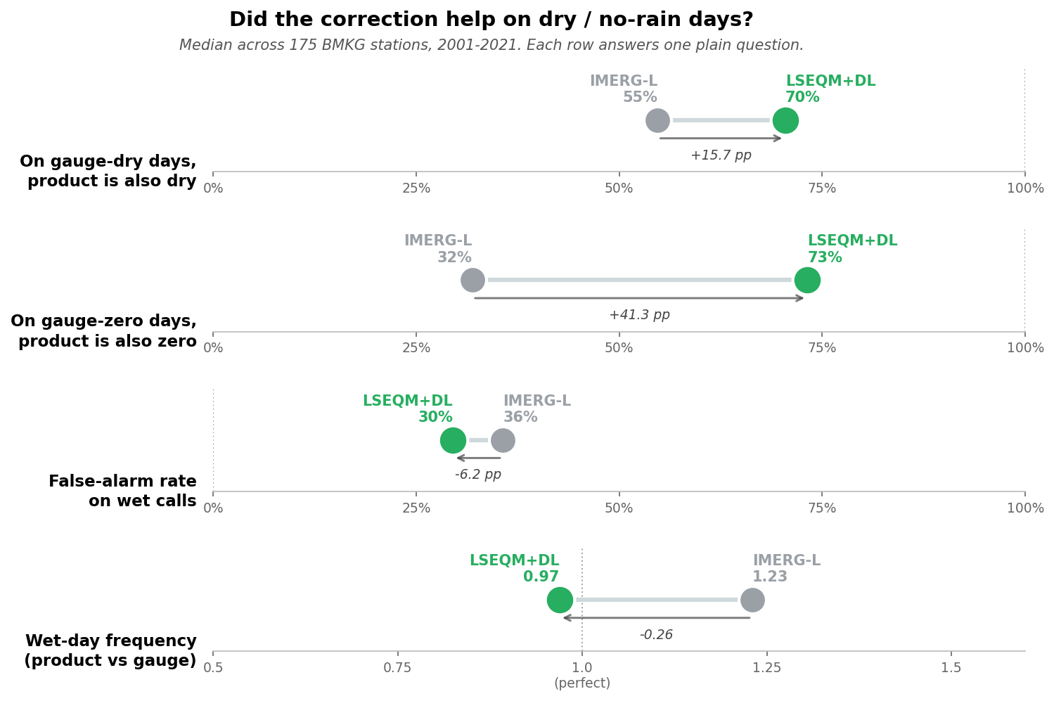{#fig-dryday-scorecard fig-align="center"}The biggest single gain is **exact-zero match**: on the 49% of days when the gauge reports a true zero, raw IMERG-L matches with a true zero only 32% of the time (it usually reports drizzle or light rain), while LSEQM+DL matches with an exact zero 73% of the time. This is the EQM dry-day reclassification visible at its sharpest.For a more technical breakdown of *what* the product reports instead of zero - the four-bin composition of gauge-dry days, and how the per-station improvement is distributed - the figure below shows both: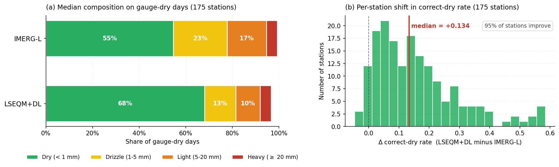{#fig-dryday-composition fig-align="center"}On the days the gauge records as dry, **IMERG-L is dry only 55% of the time** and reports drizzle / light / heavy on the rest. **LSEQM+DL pushes the dry bin to 68%**, shrinking the drizzle and light slices. The heavy slice barely moves (5% before, 5% after) - those are the rare big-event mismatches that EQM does not try to suppress. The right panel shows this is not driven by a few stations: the per-station shift is positive at **95% of the 175 stations**, with a median improvement of **+0.134** in correct-dry rate.### Spatial pattern across all stationsAcross the validated stations, the spatial pattern of heavy-day preservation is consistent across thresholds - the correction does not just work on average, it works at most individual stations:{#fig-allstation-spatial fig-align="center"}Heavy-event detection and the underlying mechanism, across the full station set: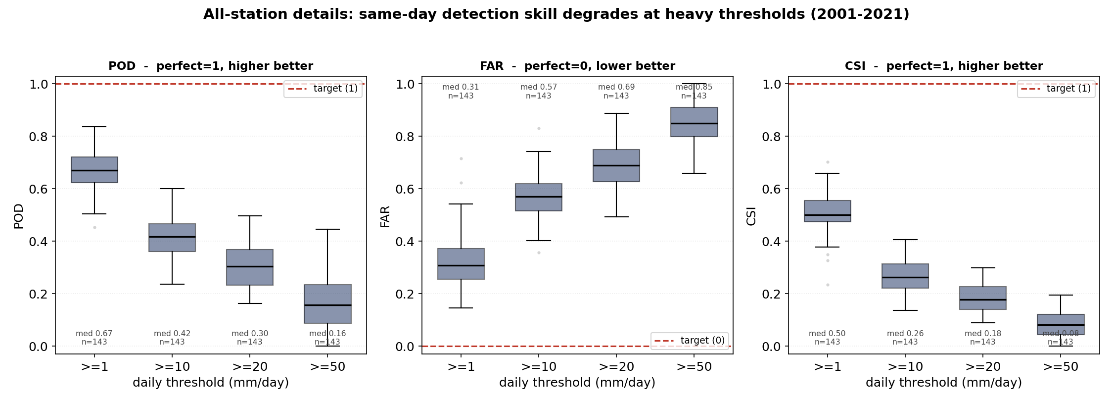{fig-align="center"}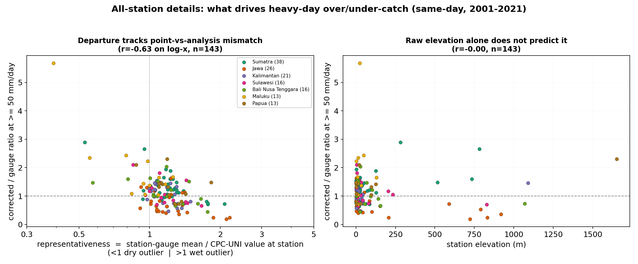{fig-align="center"}## Per-product comparisonA close look at what each stage does, day by day, at a single pixel. All products track the gauge's wet-dry rhythm; the corrected products differ mainly in how they handle intensity and the tail: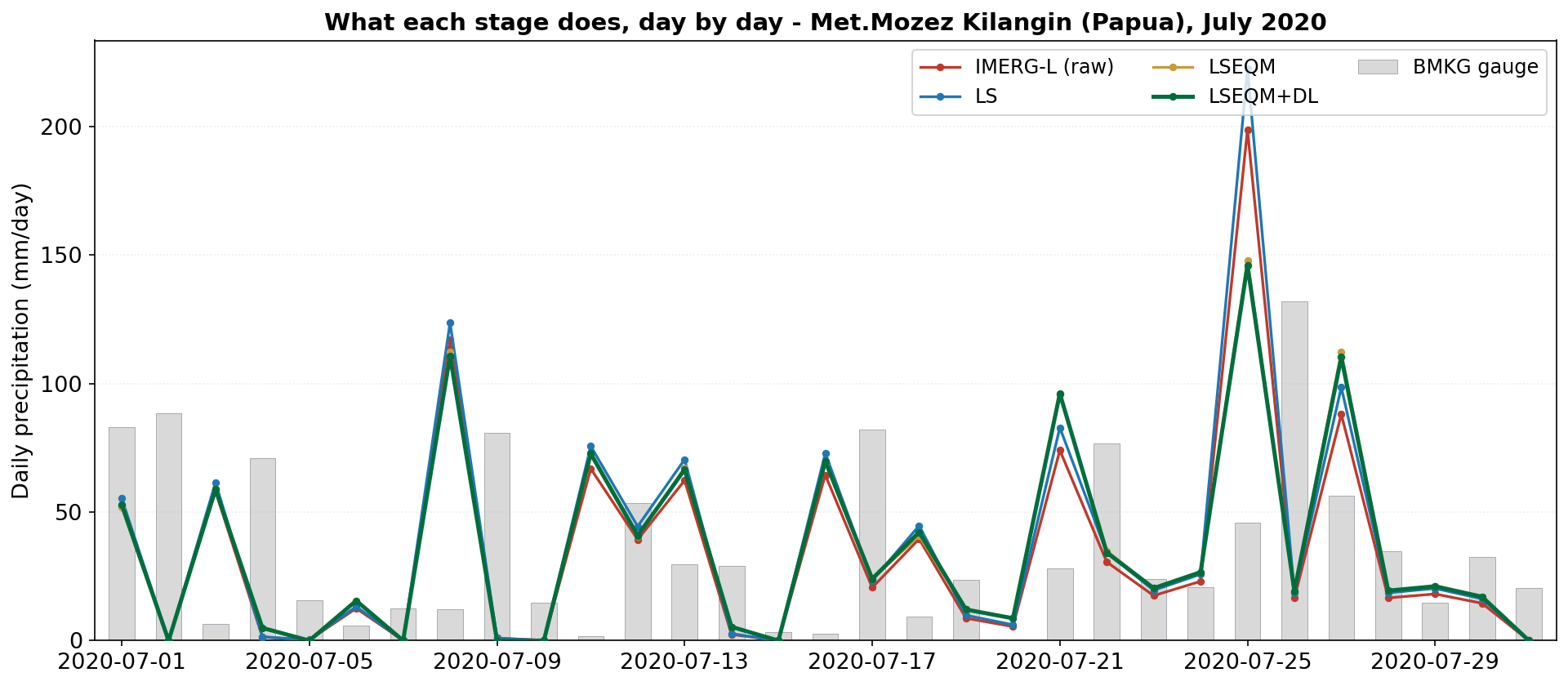{#fig-hero-zoom fig-align="center"}A full year at one pixel, all six products overlaid: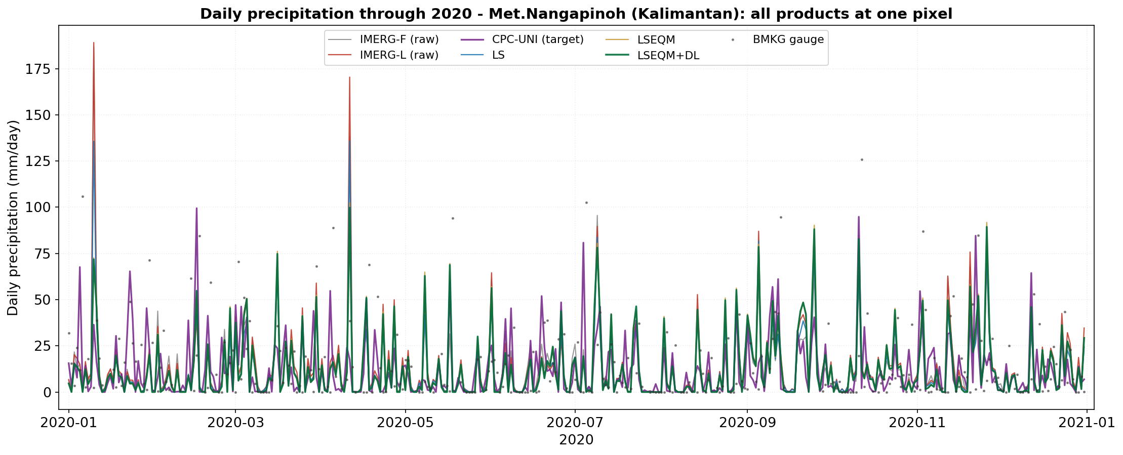{#fig-year-daily fig-align="center"}The same year as a running total tells the bias story cleanly: raw IMERG-L over-accumulates through the year, and the correction brings the cumulative curve back onto the CPC-UNI target, with the independent BMKG gauge corroborating it.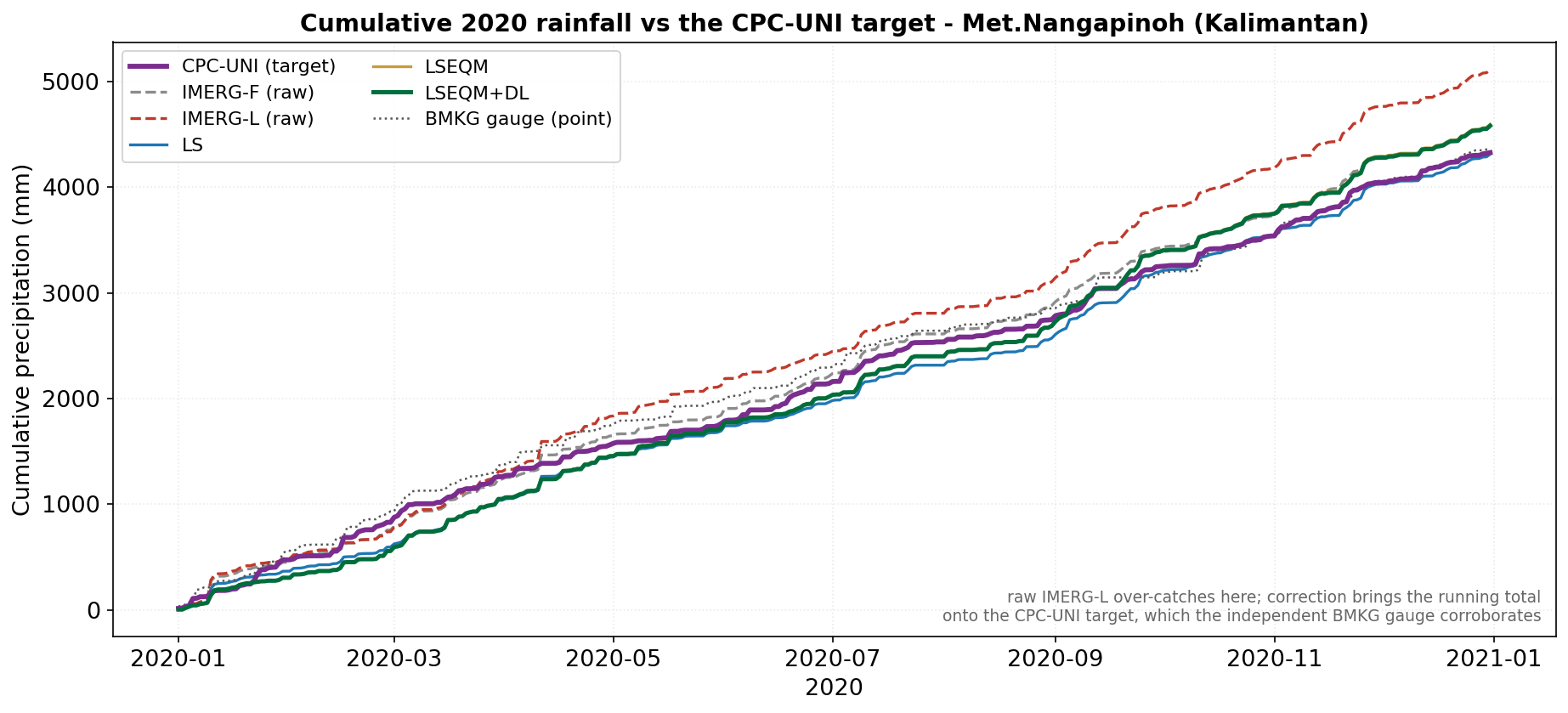{#fig-cumulative fig-align="center"}Zooming back out to every day of the 25-year record at one station, raw above and corrected below as day-by-day heatmaps, the correction preserves the wet-dry rhythm while adjusting intensity - it does not invent or erase rain days: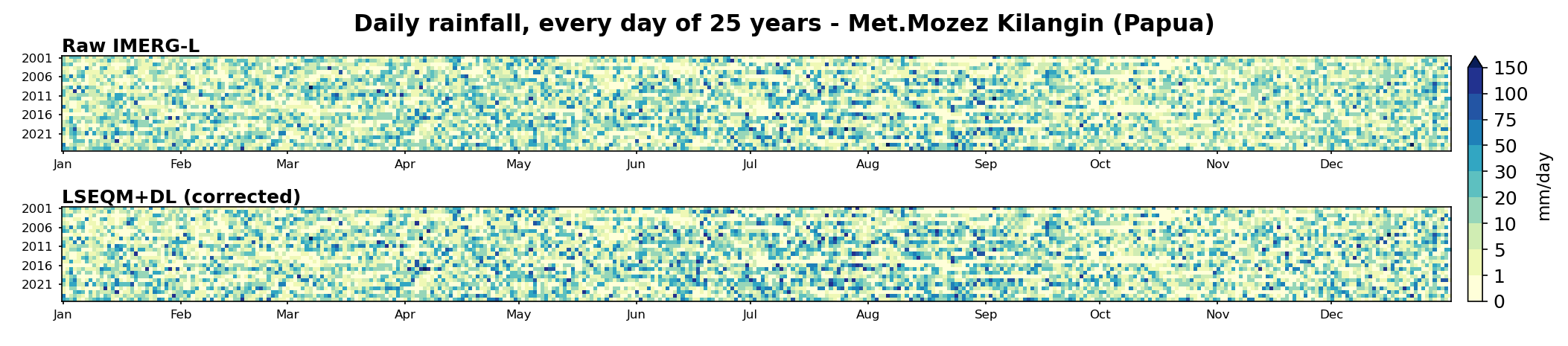{#fig-raster-compare fig-align="center"}Aggregated to monthly totals by region, and as a single-day spatial field, the corrected product is spatially coherent and seasonally consistent: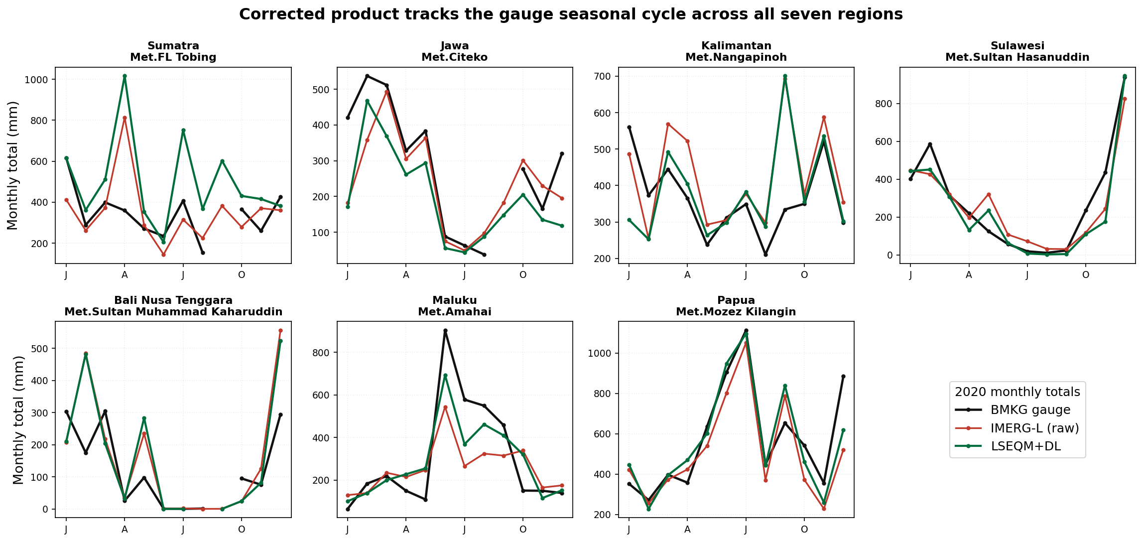{fig-align="center"}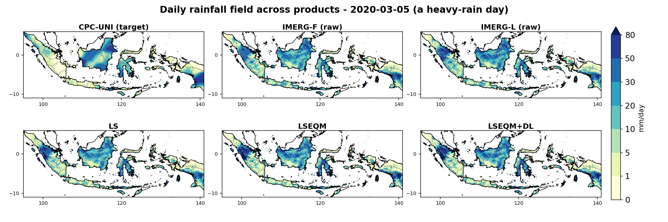{fig-align="center"}### Stage effects across the archipelagoThe single-day maps above show the products; the maps below show what the *correction* does to them, mapped over Indonesia. First, the per-pixel difference fields for one day: where the correction adds rain (red) and where it removes it (blue), and the net LSEQM+DL minus IMERG-L effect.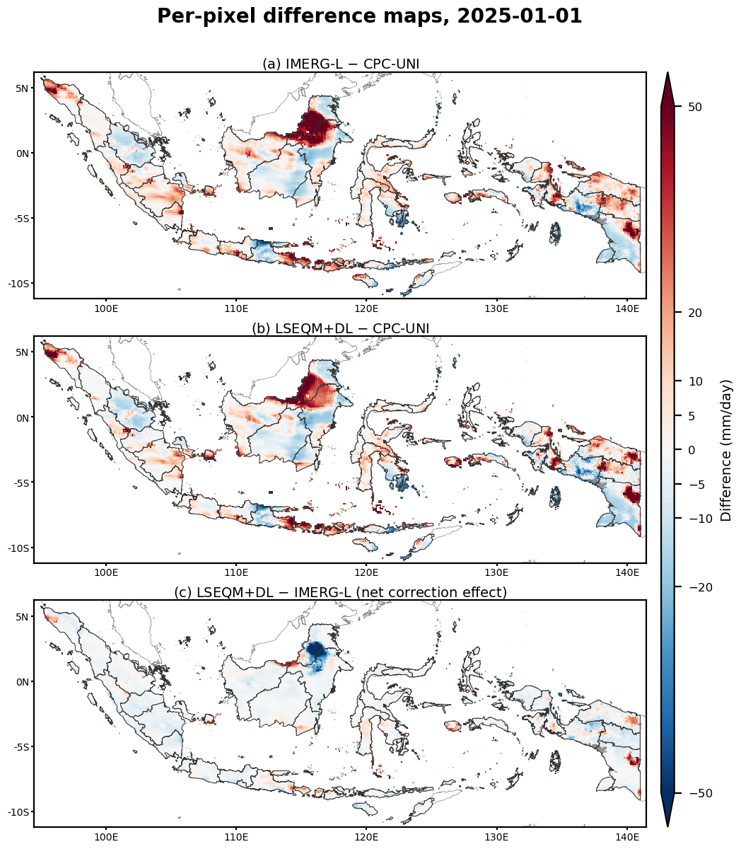{#fig-g1-diff fig-align="center"}Across three representative days, the corrected field tracks the CPC-UNI reference far more closely than raw IMERG-L, confirming the single-day view is not cherry-picked: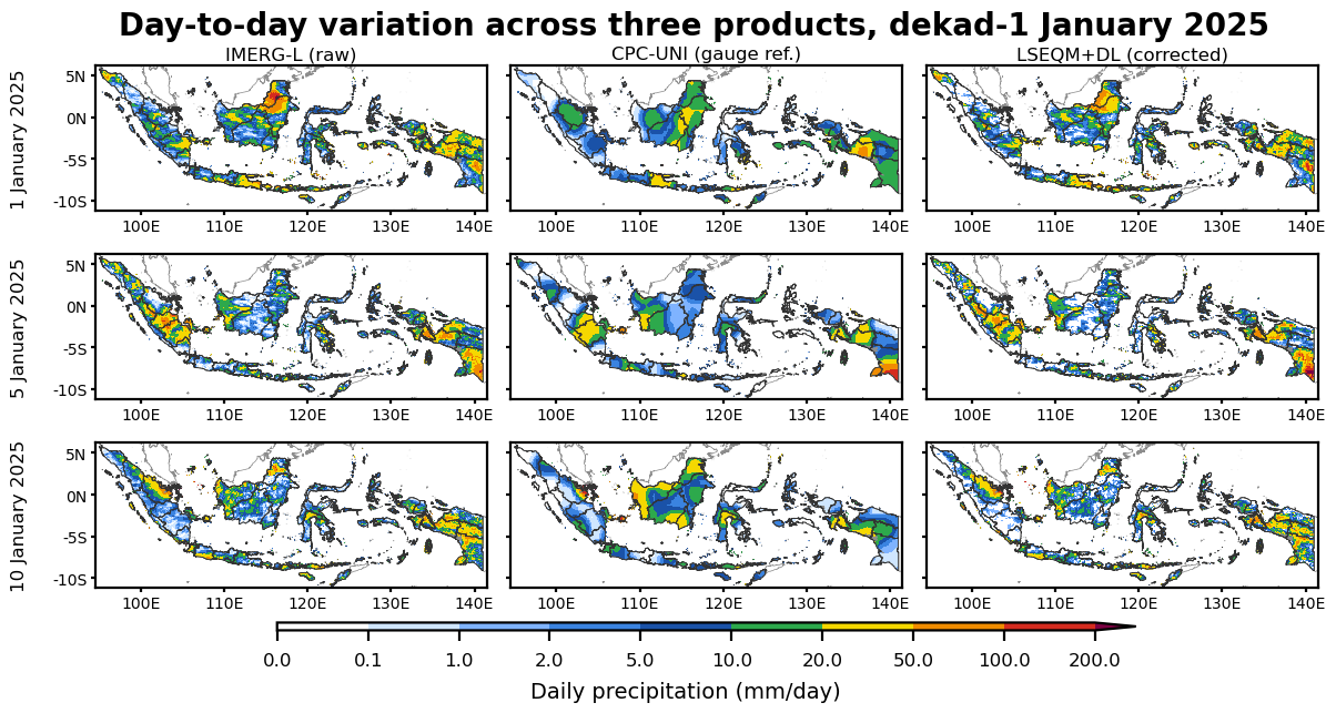{#fig-g2-three-days fig-align="center"}Reading the same comparison through the four metric pillars - relative bias, KS p-value, Q99 ratio, and CSI - mapped per pixel for each correction stage, shows where each stage earns its keep across the archipelago: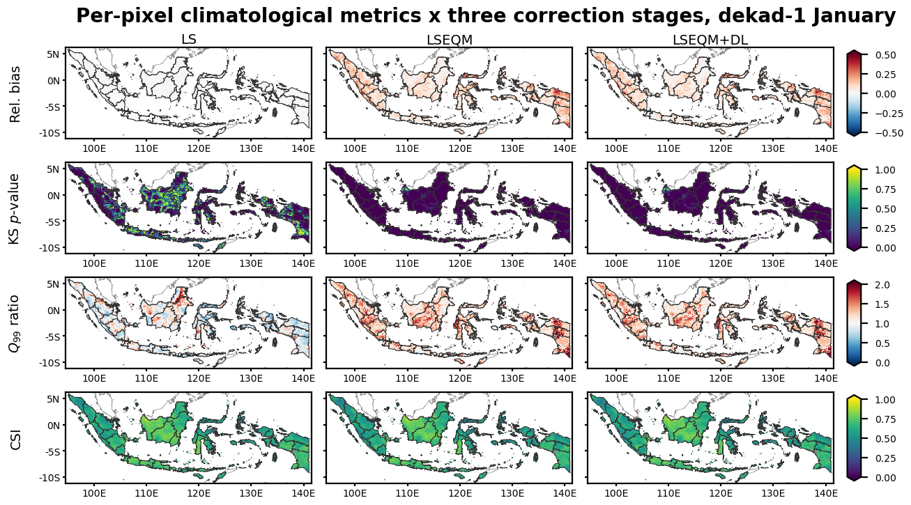{#fig-g3-pillar fig-align="center"}Finally, the dekad-1 January climatology with the BMKG station means overlaid as triangles, for each product. The corrected field's colours sit closest to the station markers, the spatial echo of the bias and distribution gains: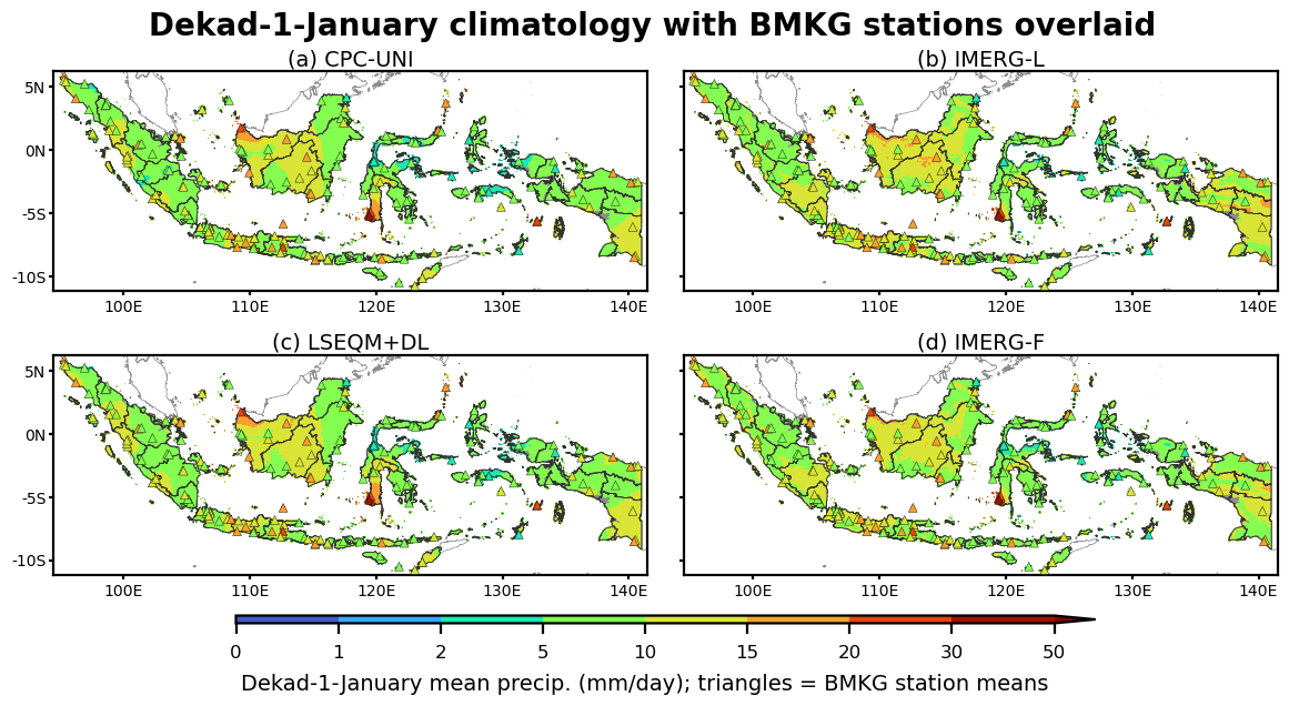{#fig-g5-overlay fig-align="center"}## Summary| Question | Answer from the Indonesia run ||----------|-------------------------------|| Does the mean improve? | Yes - relative bias near zero after LSEQM. || Does the distribution improve? | Yes - SDR 0.71 to 1.00, KS gap shrinks. || Do extremes improve? | Yes - Q99 ratio 0.71 to 1.01; heavy-day ratios move to 1.0. || Does daily correlation improve? | No - it stays pinned near 0.35 against the in-sample CPC-UNI reference (near 0.24 against the independent stations), held there by timing; a large part of that limit is a calendar-window artefact. || Does the composite CQI rise? | No - it is dominated by timing-sensitive components that marginal correction barely moves. || Does the CNN help? | Marginally and only where gauges are dense; it is a refinement, gated by station density. |The framework's contribution is therefore twofold: a working, transferable correction that fixes what marginal bias correction *can* fix (values, distributions, extremes), and an honest diagnostic of the ceiling on what it *cannot* (daily timing), with evidence that a large part of that ceiling is a fixable windowing artefact rather than irreducible error.For the data and code behind these figures, see the [Zenodo deposit](https://doi.org/10.5281/zenodo.20287846) and the [GitHub repository](https://github.com/bennyistanto/hybrid-bias-correction).


































