Reading the Results
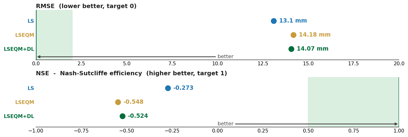
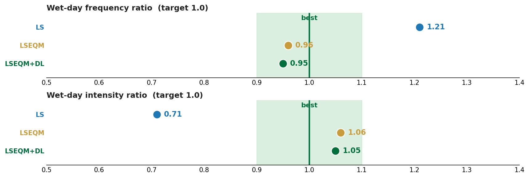
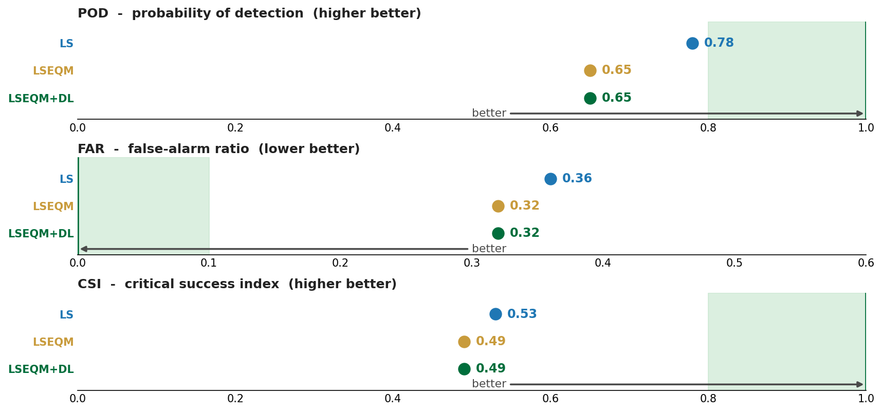
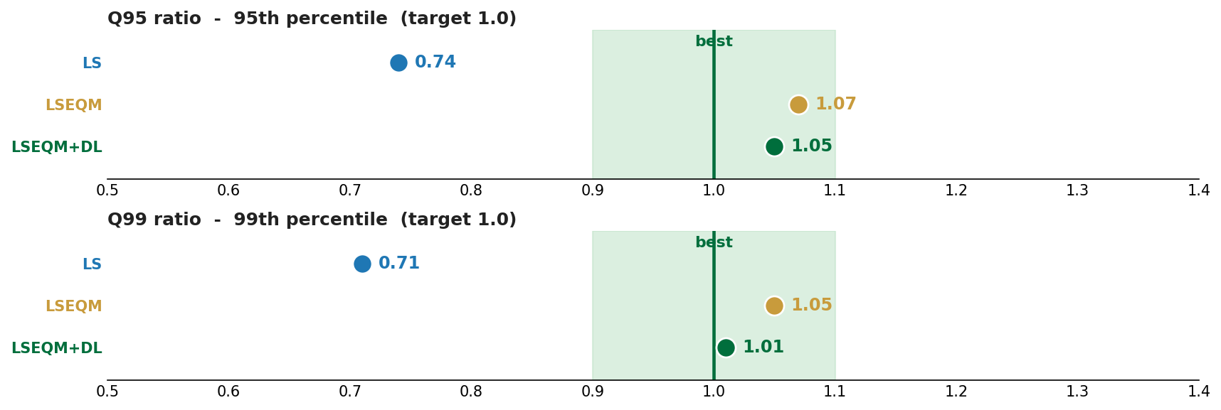
Before looking at the Bali or Indonesia results, it helps to know how to read the numbers. The framework reports metrics in several families, following WMO verification guidance (WMO/TD-1485, WMO-No. 1317). Each card below places the three correction stages (LS, LSEQM, LSEQM+DL) on a number line, with the target value and the “better” direction marked.
The values shown on the cards are from the full Indonesia run (172 validated stations). They are illustrative of the shape of each metric, not the headline result - for that, see the Indonesia study.
Mean and bias
How close the long-term average is to the gauge. Relative bias is the headline mean-error metric; the target is zero.

Variability
Whether the corrected field has the right amount of day-to-day spread. The standard-deviation ratio (SDR) compares the corrected variance to the gauge; the target is 1.0. Raw and LS-corrected satellite is usually too smooth (SDR < 1); EQM restores the spread.

Error and efficiency
Root-mean-square error (lower is better, target 0) and Nash-Sutcliffe efficiency (higher is better, target 1). These are the metrics most sensitive to day-to-day timing, and they are where daily satellite precipitation struggles most - see the correlation ceiling for why.
Distribution shape
The Kolmogorov-Smirnov statistic measures the largest gap between the corrected and gauge cumulative distributions; the target is 0 (distributions identical). This is where EQM does its work.

Correlation
Pearson correlation of daily values against the gauge. Higher is better, but for daily satellite precipitation this metric stays well below 1, held down by factors the correction cannot touch - see the correlation ceiling.

Wet-day frequency
Whether the corrected field rains on about the right number of days. The wet-day frequency ratio compares corrected wet-day count to the gauge at the 1 mm/day threshold; the target is 1.0.
Categorical detection
Did the product rain on the days the gauge says it rained? Probability of detection (POD), false-alarm ratio (FAR), and critical success index (CSI) summarise hit/miss/false-alarm behaviour at a chosen threshold. These are computed at multiple thresholds (1 to 150 mm/day) to show how detection skill degrades with intensity.
Extremes
How well the upper tail is reproduced: the 99th-percentile ratio (Q99, target 1.0) and heavy-day detection. This is what the GPD tail graft targets.
The Continuous Quality Index
Most of the metrics above are folded into a single 0-1 Continuous Quality Index (CQI) per pixel, a weighted blend of basic-statistics, distribution, and temporal components. The QA Framework tutorial explains the CQI in detail, and the Indonesia study shows it mapped across the archipelago.
A recurring pattern in the results: distribution and extreme metrics improve markedly under LSEQM, while correlation and NSE barely move. This is expected, not a defect. Reading the cards above with that in mind makes the case-study results much easier to interpret.